
In 33 charts. A special word about San Francisco where AI mania trickled down from a “mansion shortage” to mid-tier homes.
By Wolf Richter for WOLF STREET.
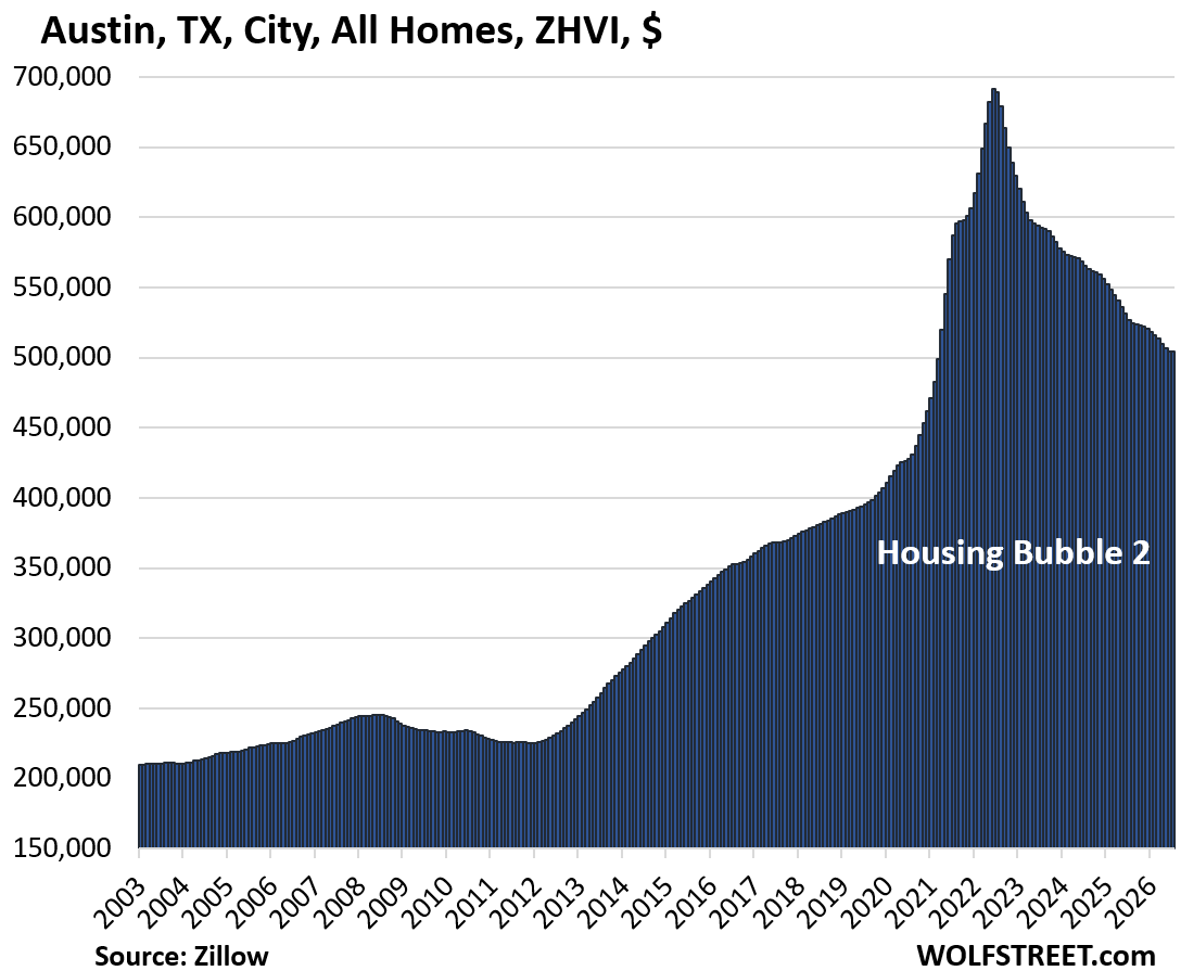
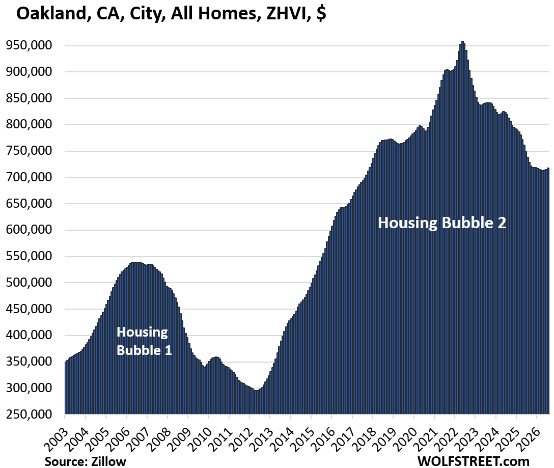
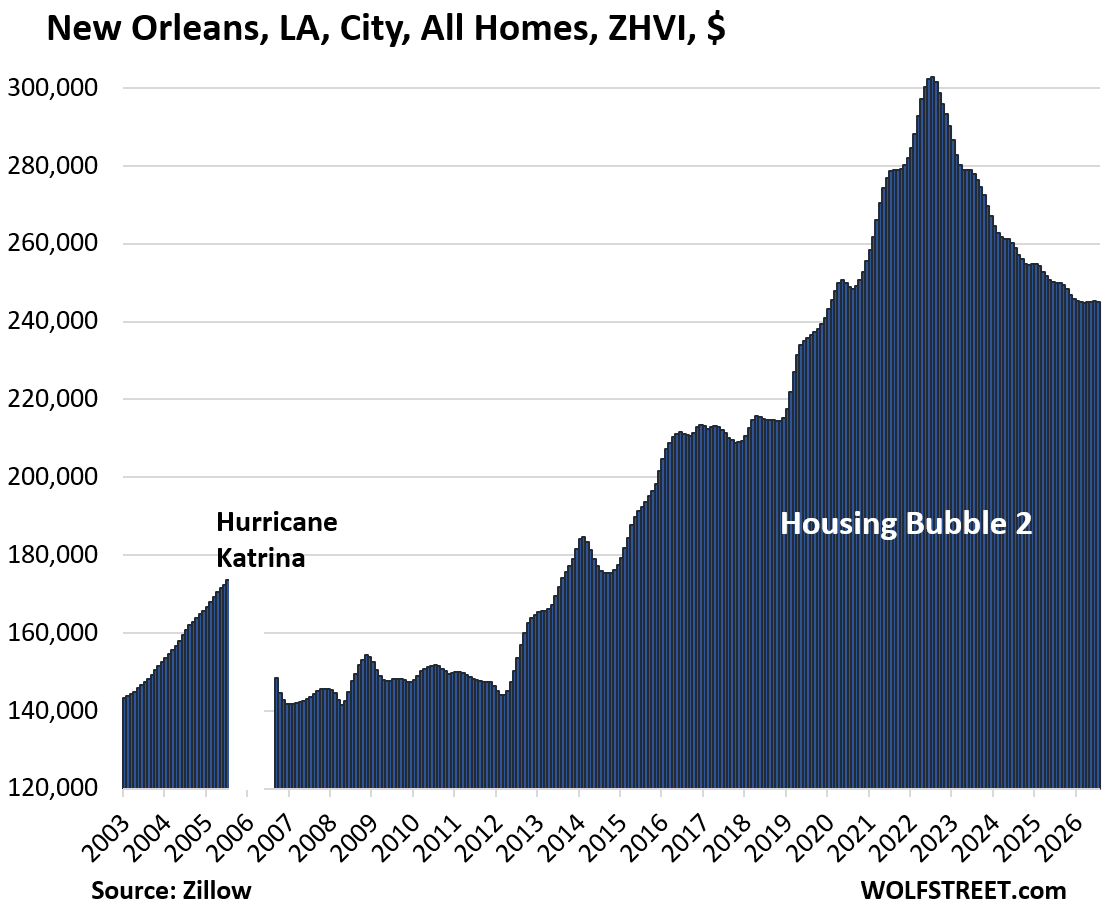
The 33 price charts are below. Here’s the summary. Prices of mid-tier homes (single-family, condos, and co-ops) in June were down from their respective peaks in prior years in 28 of the 33 big and expensive cities we track here, led by Austin (-27%), Oakland (-25%), and New Orleans (-19%).
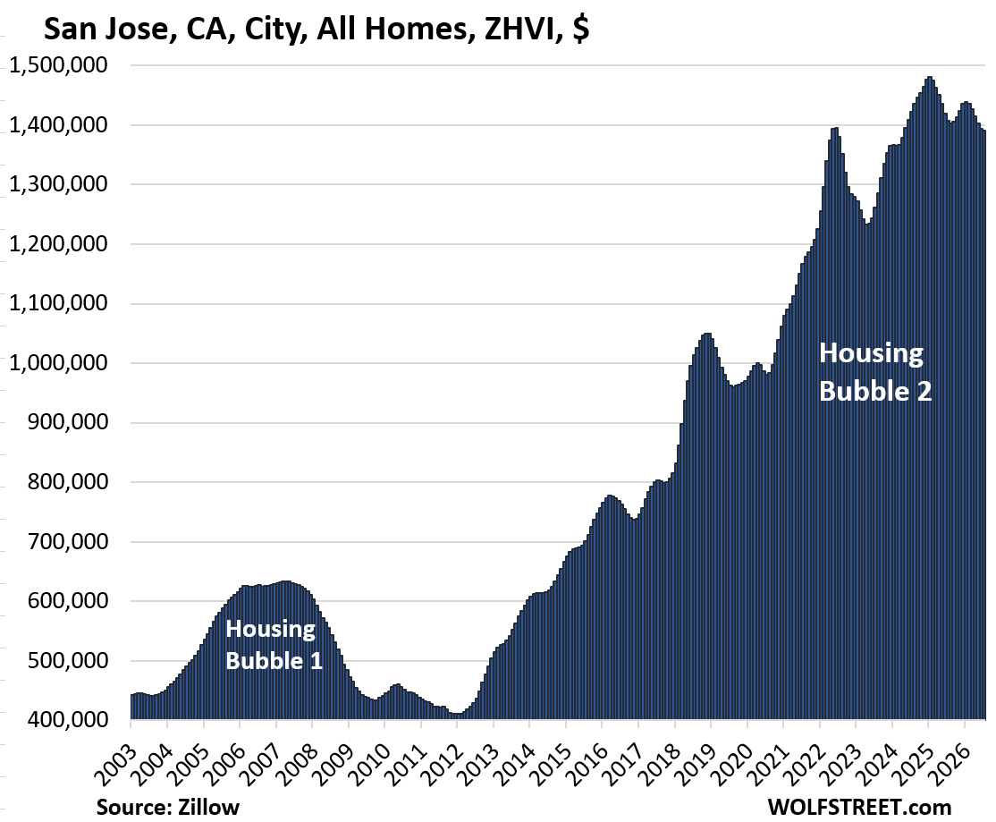
In most of those cities, the highs were either in 2022 (17 cities) or in 2024 (9 cities). In two cities, the highs occurred in early 2025: Boston (April 2025) and San Jose (January 2025).
Year-over-year, prices declined in 24 of the 33 big and expensive cities, led by Austin (-4.4%), Las Vegas (-3.1%), and Nashville (-3.0%).
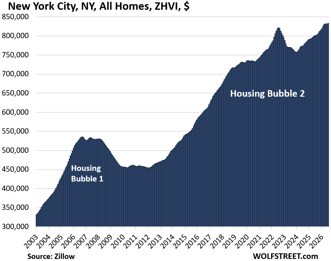
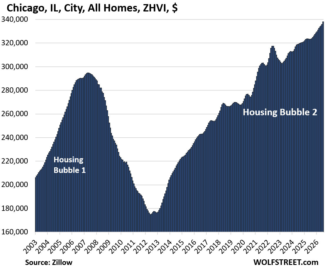
And in 2 of the 33 cities, home prices rose to new highs: Chicago and New York City.
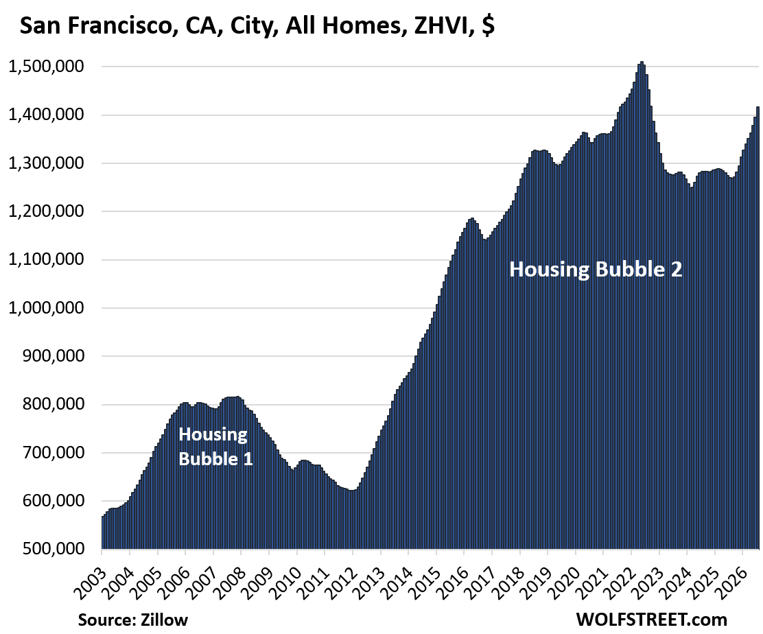
A special word about San Francisco, the epicenter of AI: It’s where AI mania has bled into the housing market. It started in the luxury market, leading to a “mansion shortage,” as it’s called. In recent months, the AI mania effects trickled down into the mid-tier market that we track here, and mid-tier prices have begun to spike. In July, mid-tier prices spiked by 1.5% from June, bringing the year-over-year spike to 11.6%.
Not long ago, San Francisco was near the top of the list of home-price declines. In the second half last year, mid-tier home prices flipped from declining to surging. Despite the spike since then, mid-tier home prices in July were still 6% below the all-time high of 2022. Given the magnitude of the recent spikes, and if AI mania lasts long enough, mid-tier prices could set a new high before yearend for the first time since 2022. The chart below is quite something.
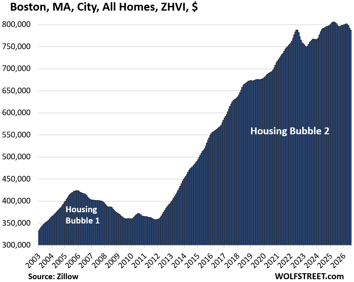
Earlier this year, Boston joined the line-up of cities with price declines from highs in prior years. Mid-tier home prices fell by 0.5% in July from June, by 1.4% year-over-year, and by 2.3% from the high in April 2025.
| Cities with Price Declines from Peak in Prior Years | From peak | Year of peak | YoY | ||
| 1 | Austin | TX | -27% | 2022 | -4.4% |
| 2 | Oakland | CA | -25% | 2022 | -2.7% |
| 3 | New Orleans | LA | -19% | 2022 | -1.9% |
| 4 | Washington | DC | -13% | 2022 | -1.7% |
| 5 | Denver | CO | -13% | 2022 | -2.7% |
| 6 | Phoenix | AZ | -11% | 2022 | -1.8% |
| 7 | Fort Worth | TX | -10% | 2022 | -2.0% |
| 8 | Portland | OR | -10% | 2022 | -0.1% |
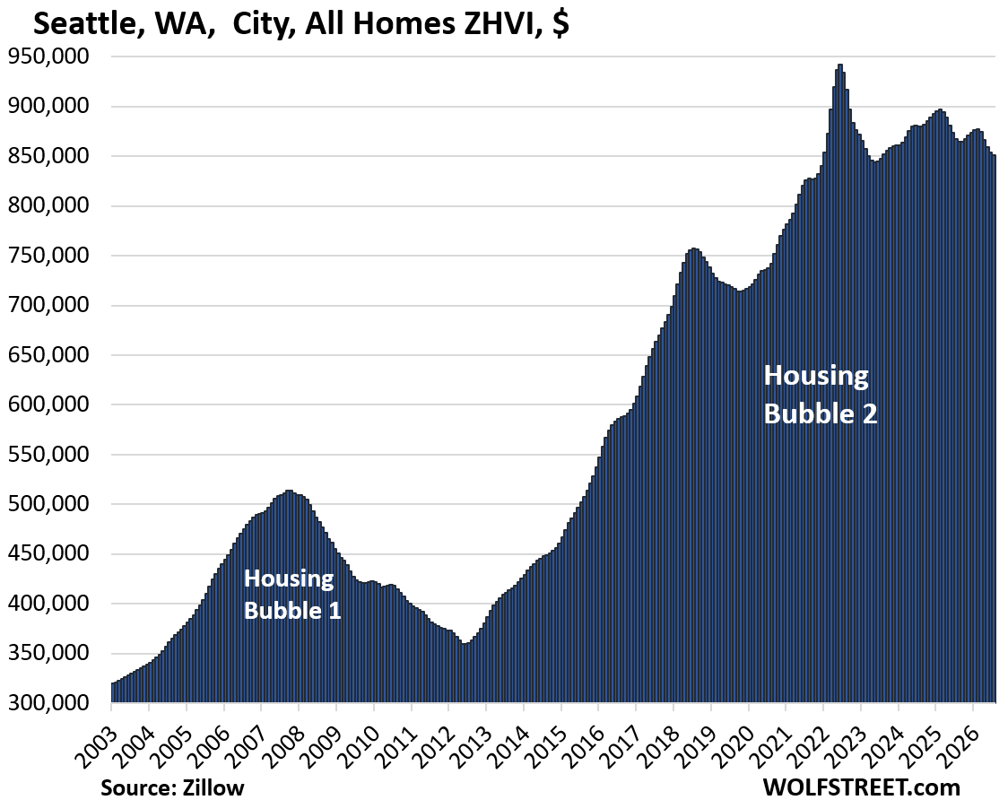
| 9 | Seattle | WA | -10% | 2022 | -1.8% |
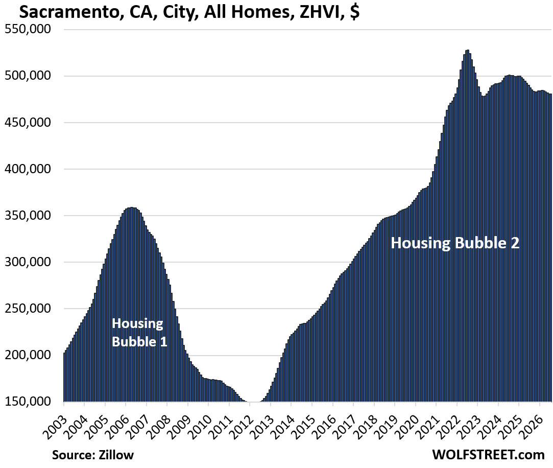
| 10 | Sacramento | CA | -9% | 2022 | -1.4% |
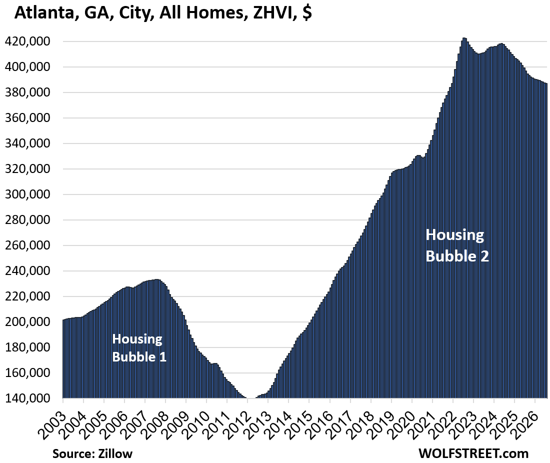
| 11 | Atlanta | GA | -8% | 2022 | -2.4% |
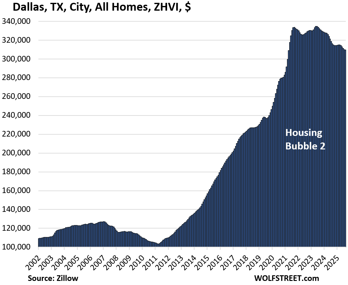
| 12 | Dallas | TX | -8% | 2024 | -2.1% |
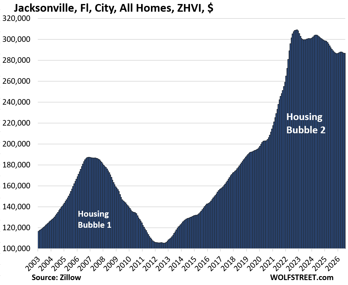
| 13 | Jacksonville | FL | -7% | 2024 | -1.3% |
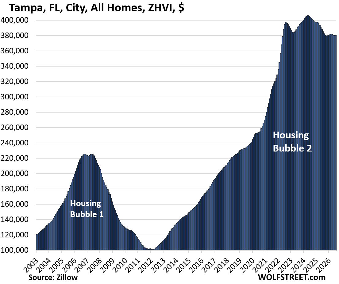
| 14 | Tampa | FL | -6% | 2024 | -1.3% |
| 15 | San Francisco | CA | -6% | 2022 | 11.6% |
| 16 | San Jose | CA | -6% | 2025 | -1.1% |
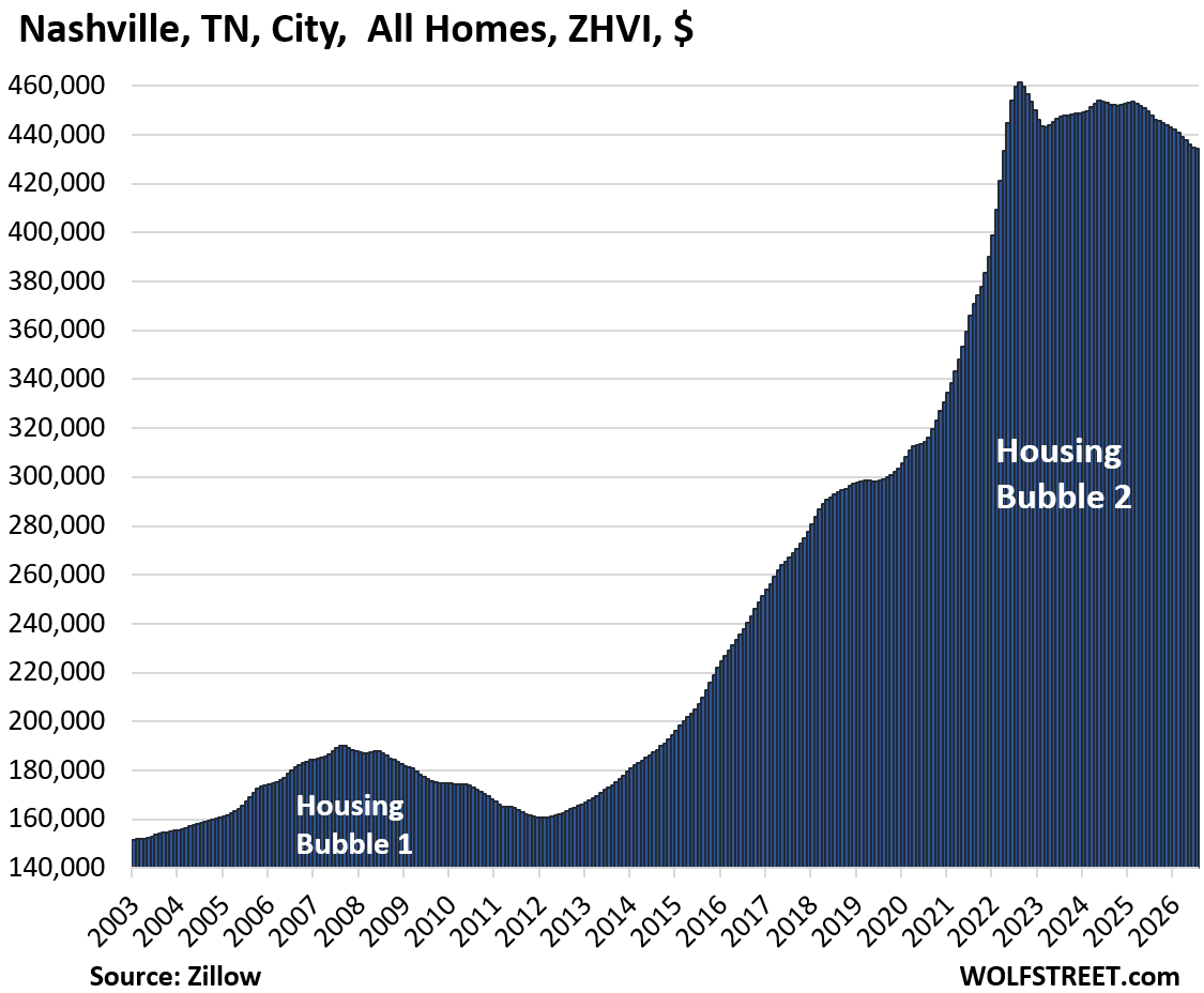
| 17 | Nashville | TN | -6% | 2022 | -3.0% |
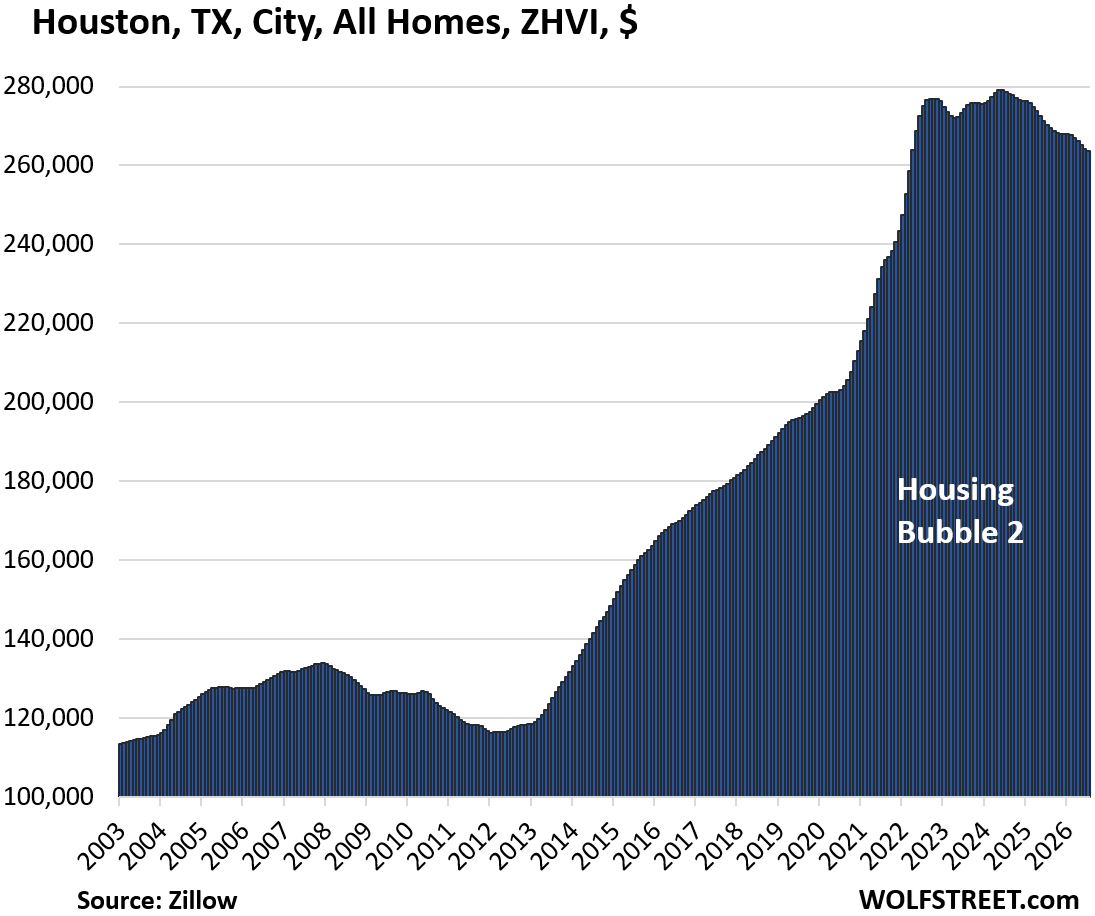
| 18 | Houston | TX | -6% | 2024 | -2.5% |
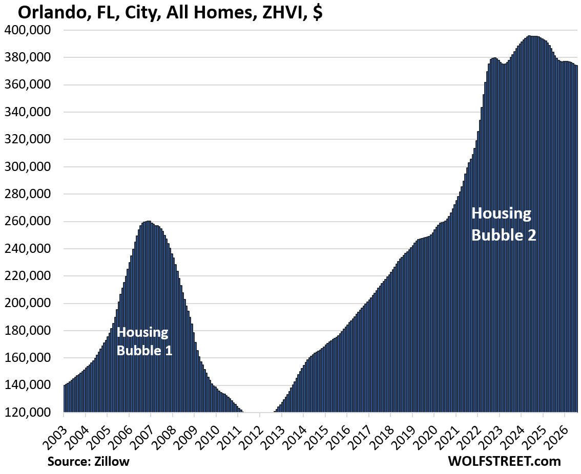
| 19 | Orlando | FL | -5% | 2024 | -1.9% |
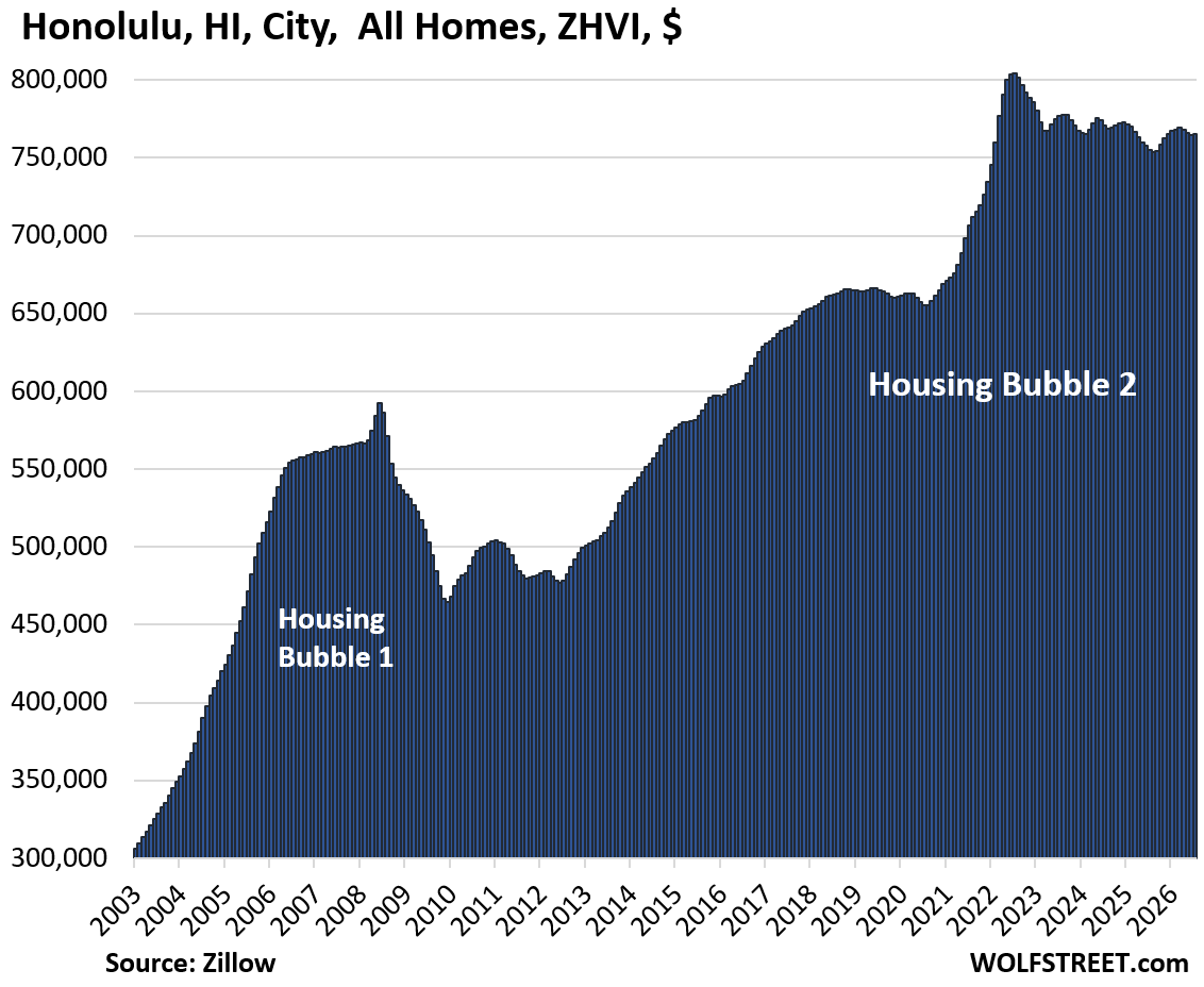
| 20 | Honolulu | HI | -5% | 2022 | 1.4% |
| 21 | Las Vegas | NV | -5% | 2022 | -3.1% |
| 22 | Raleigh | NC | -5% | 2022 | -2.0% |
| 23 | San Diego | CA | -4% | 2024 | -1.0% |
| 24 | Los Angeles | CA | -4% | 2024 | -0.5% |
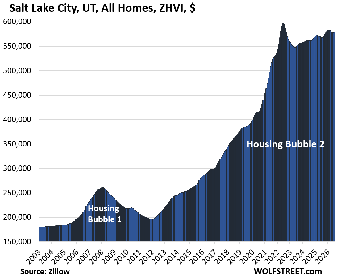
| 25 | Salt Lake City | UT | -3% | 2022 | 2.1% |
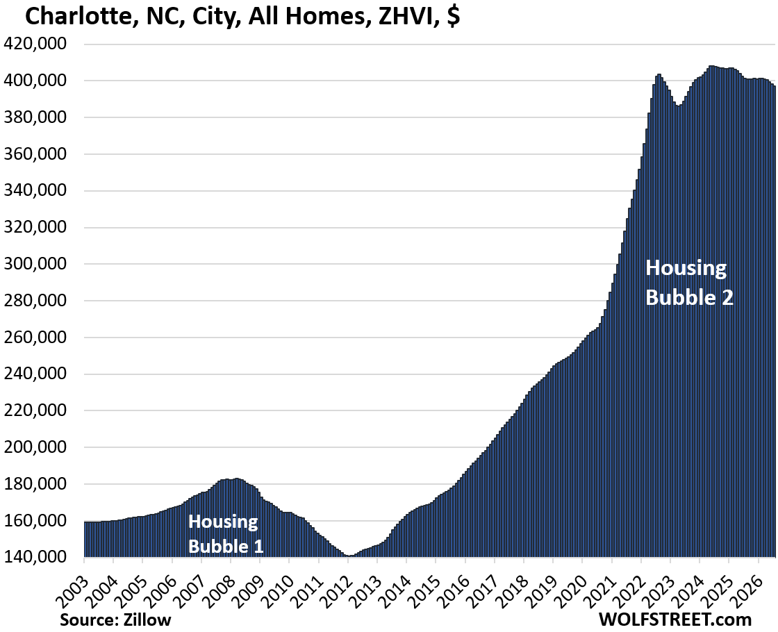
| 26 | Charlotte | NC | -3% | 2024 | -1.0% |
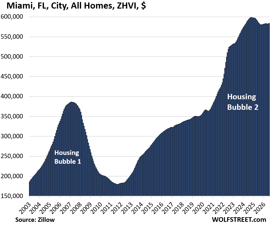
| 27 | Miami | FL | -3% | 2024 | 0.0% |
| 28 | Boston | MA | -2% | 2025 | -1.4% |
But prices had exploded in these cities in the two years between mid-2020 and mid-2022, including in Austin (+62%), Phoenix (+60%), Fort Worth (+50%), Raleigh (+49%), and Sacramento (+39%). This home price explosion came on top of already high prices.
The home price explosion was caused by the Fed’s reckless monetary policies, which included trillions of dollars of purchases of Treasury securities and mortgage-backed securities (MBS), with newly created money, which produced the below-3% mortgage rates, even as inflation was surging at the time toward 9%. Americans responded with off-the-chart FOMO buying behavior at the time. The FOMO was about mortgage rates, and people trampled all over each other and bid up prices in order to buy a home to lock in these mortgages.
In cities where prices have dropped from those peaks, these buyers now have below 3% mortgages on homes who prices have dropped, and they’re fine as long as they stay put.

The price index here is the seasonally adjusted three-month-average mid-tier Zillow Home Value Index (ZHVI) for single-family homes, condos, and co-ops. Mid-tier means the middle-third by price in each market. The ZHVI is a backward-looking measure based on millions of data points in Zillow’s “Database of All Homes,” including transaction data from public records (tax data), MLS, brokerages, local Realtor Associations, real-estate agents, and households across the US. It includes pricing data for off-market deals and for-sale-by-owner deals.
To qualify for the list, the city must be one of the largest by population and be among the expensive cities where the ZHVI for all mid-tier homes (single-family, condos, and co-ops) must have been at least $300,000 at some point.
Some large cities don’t qualify for this list because the ZHVI for mid-tier homes never reached $300,000, despite the surge in recent years, such as the cities of Houston, Philadelphia, Memphis, Oklahoma City, Tulsa, Kansas City, Cincinnati, Pittsburgh, and many others.
In those less expensive cities, five mid-tier homes combined sell for less than one mid-tier home in San Francisco. Not every city in America is an expensive housing market! Some cities have quite reasonable prices.
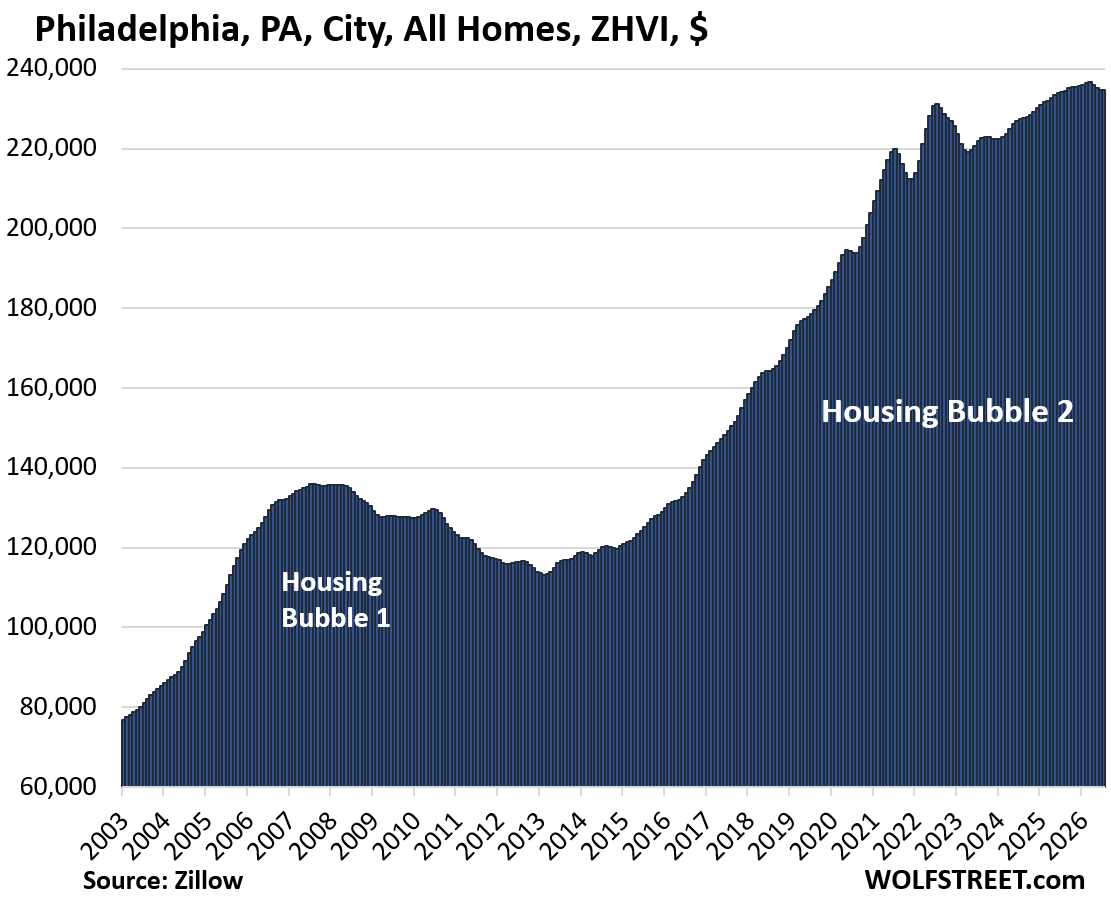
But Houston and Philadelphia are included anyway because they’re the fourth-largest and sixth-largest cities in the US.
Home prices in 33 big and expensive cities in America.
In the little tables, MoM = month over month; YoY = year-over-year. The column furthest to the right shows the percentage increase “since 2000.” All seasonally adjusted.
| Austin, TX, City, All Homes, Prices | |||
| From Jun 2022 peak | MoM | YoY | Since 2000 |
| -27% | -0.1% | -4.4% | 150% |
Lowest since March 2021.
| Oakland, City, CA, All Homes, Prices | |||
| From May 2022 peak | MoM | YoY | Since 2000 |
| -25% | 0.4% | -2.7% | 248% |
Prices are where they’d first been in October 2017.
| New Orleans, LA, City, All Homes, Prices | |||
| From Jun 2022 peak | MoM | YoY | Since 2007 |
| -19% | 0.0% | -1.9% | 106% |
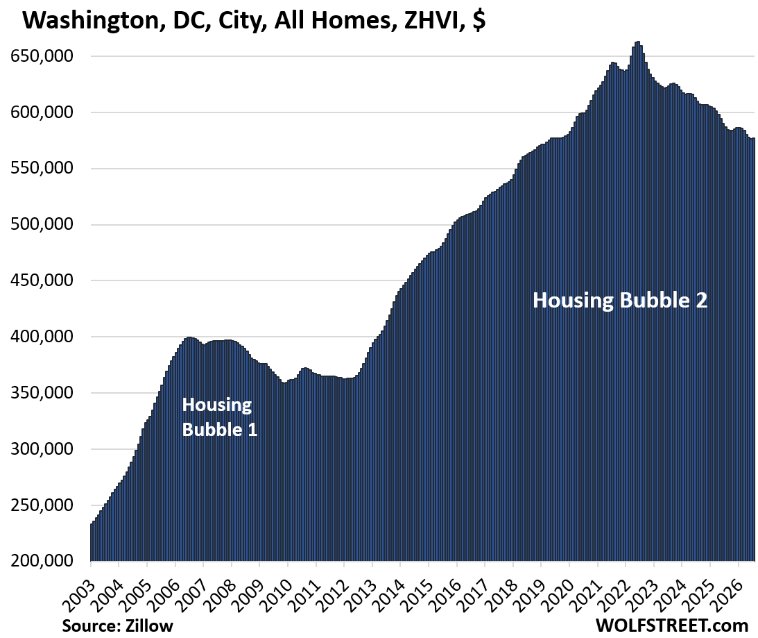
| Washington D.C., All Homes, Prices | |||
| From Jun 2022 peak | MoM | YoY | Since 2000 |
| -13% | 0.1% | -1.7% | 254% |
Where prices had first been in December 2019.
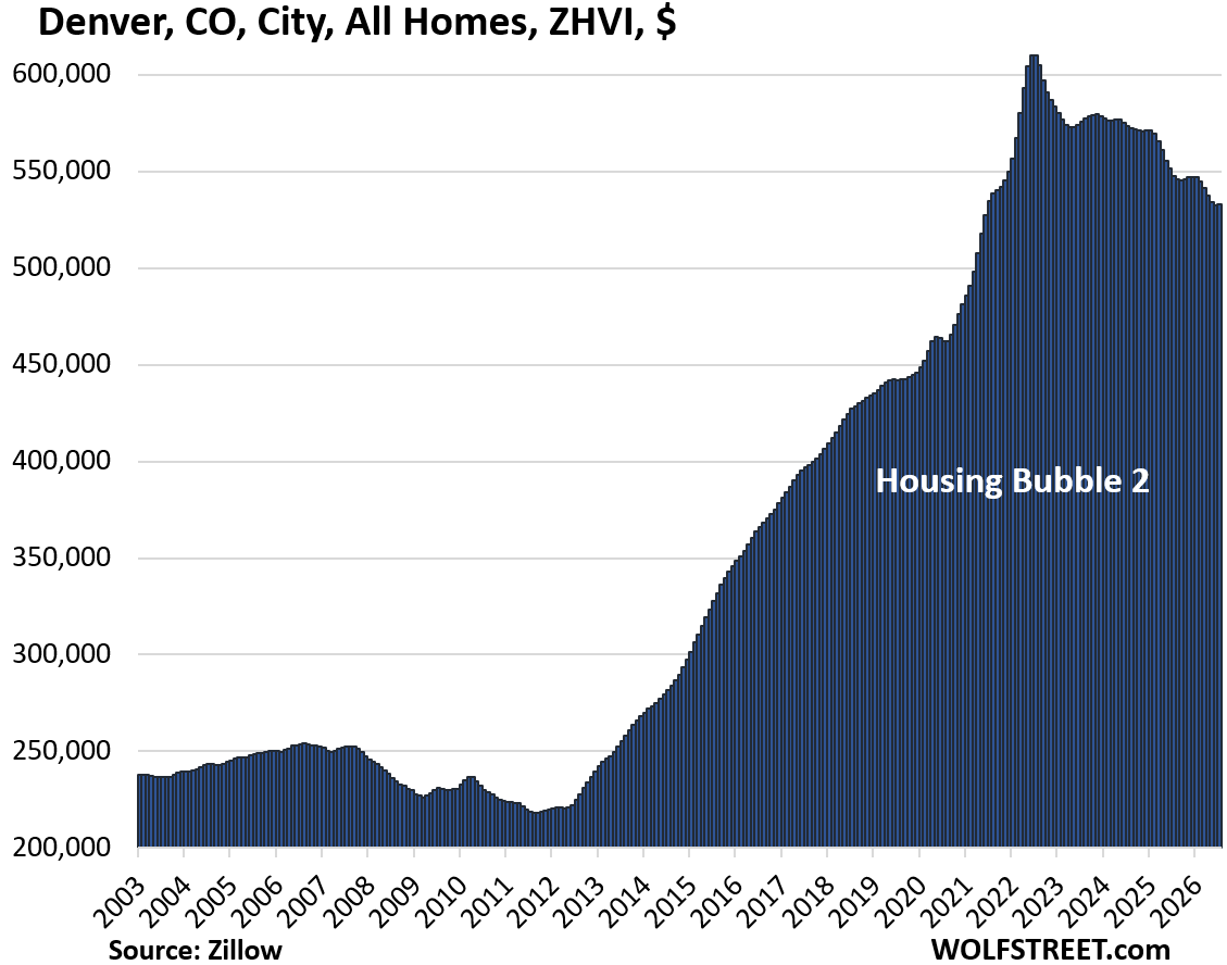
| Denver, CO, City, All Homes, Prices | |||
| From Jun 2022 peak | MoM | YoY | Since 2000 |
| -13% | 0.1% | -2.7% | 196% |
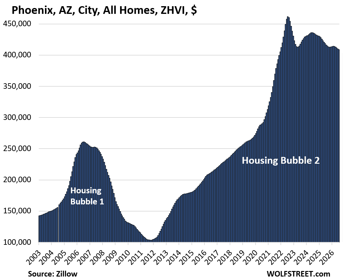
| Phoenix, AZ, City, All Homes, Prices | |||
| From Jul 2022 peak | MoM | YoY | Since 2000 |
| -11% | -0.2% | -1.8% | 245% |
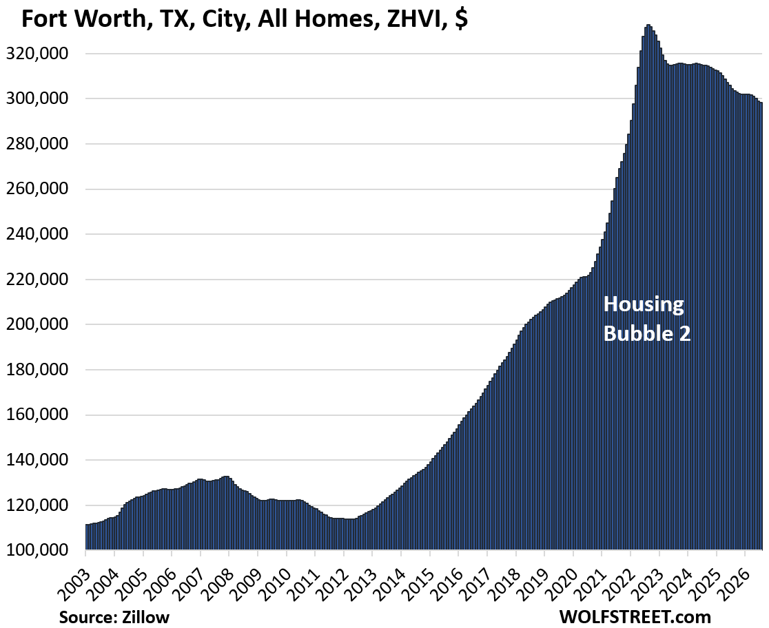
| Fort Worth, TX, City, All Homes, Prices | |||
| From Aug 2022 peak | MoM | YoY | Since 2000 |
| -10% | -0.2% | -2.0% | 186% |
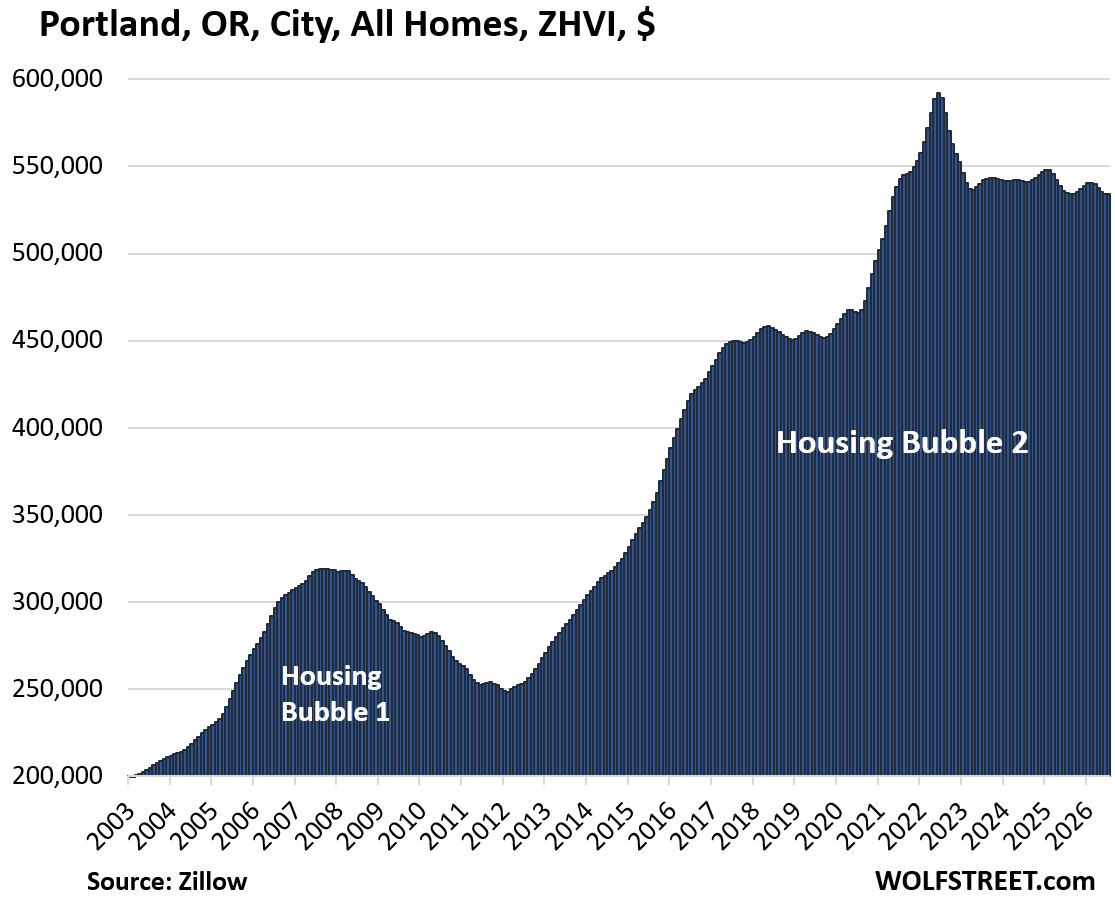
| Portland, OR, City, All Homes, Prices | |||
| From May 2022 peak | MoM | YoY | Since 2000 |
| -10% | 0.1% | -0.1% | 214% |
| Seattle, WA, City, All Homes, Prices | |||
| From May 2022 peak | MoM | YoY | Since 2000 |
| -10% | -0.3% | -1.8% | 221% |
| Sacramento, CA, City, All Homes, Prices | |||
| From July 2022 peak | MoM | YoY | Since 2000 |
| -9% | -0.1% | -1.4% | 283% |
| Atlanta, GA, City, All Homes, Prices | |||
| From Jun 2022 peak | MoM | YoY | Since 2000 |
| -8% | -0.1% | -2.4% | 139% |
| Dallas, TX, City, All Homes, Prices | |||
| From May 2024 peak | MoM | YoY | Since 2000 |
| -8% | -0.1% | -2.1% | 211% |
| Jacksonville, FL, City, All Homes, Prices | |||
| From Nov 2022 peak | MoM | YoY | Since 2000 |
| -7% | -0.1% | -1.3% | 203% |
| Tampa, FL, City, All Homes, Prices | |||
| From May 2024 peak | MoM | YoY | Since 2000 |
| -6% | 0.1% | -1.3% | 310% |
| San Francisco, CA, City, All Homes, Prices | |||
| From May 2022 peak | MoM | YoY | Since 2000 |
| -6% | 1.5% | 11.6% | 241% |
| San Jose, CA, City, All Homes, Prices | |||
| From Jan 2025 peak | MoM | YoY | Since 2000 |
| -6% | -0.2% | -1.1% | 330% |
| Nashville, TN, City, All Homes, Prices | |||
| From July 2022 peak | MoM | YoY | Since 2000 |
| -6% | -0.2% | -3.0% | 210% |
| Houston, TX, City, All Homes, Prices | |||
| From Jul 2022 peak | MoM | YoY | Since 2000 |
| -6% | -0.3% | -2.5% | 151% |
| Orlando, FL, City, All Homes, Prices | |||
| From Jun 2024 peak | MoM | YoY | Since 2000 |
| -5% | -0.1% | -1.9% | 238% |
| Honolulu, HI, City, All Homes, Prices | |||
| From Jun 2022 peak | MoM | YoY | Since 2000 |
| -5% | 0.1% | 1.4% | 206% |
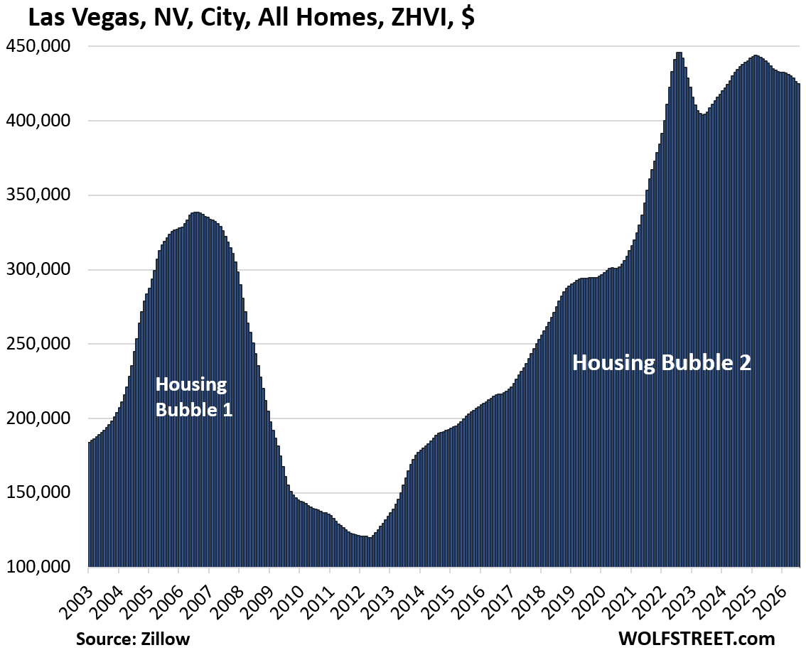
| Las Vegas, NV, City, All Homes, Prices | |||
| From June 2022 peak | MoM | YoY | Since 2000 |
| -5% | -0.4% | -3.1% | 173% |
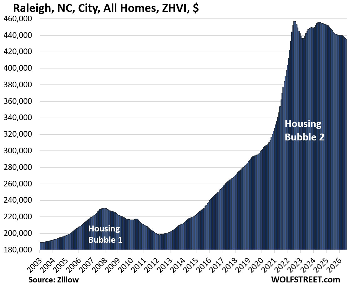
| Raleigh, NC, City, All Homes, Prices | |||
| From July 2022 peak | MoM | YoY | Since 2000 |
| -5% | -0.2% | -2.0% | 147% |
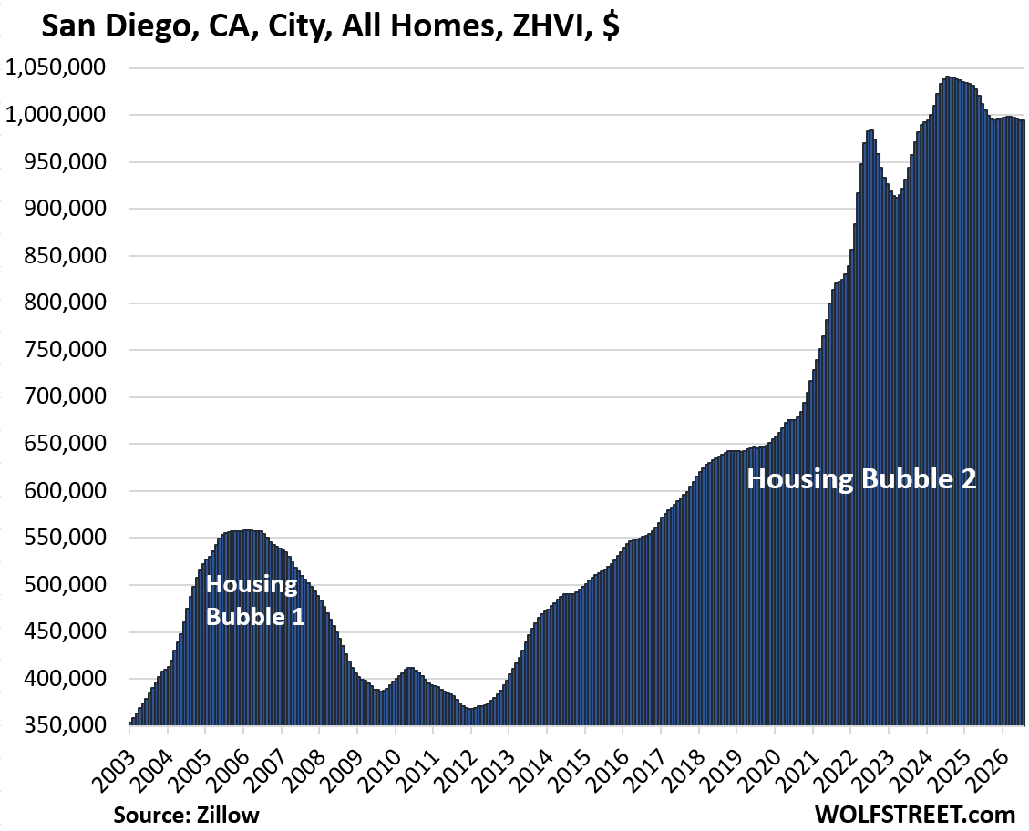
| San Diego, CA, City, All Homes, Prices | |||
| From July 2024 peak | MoM | YoY | Since 2000 |
| -4% | 0.0% | -1.0% | 346% |
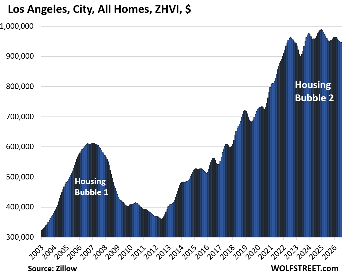
| Los Angeles, CA, City, All Homes, Prices | |||
| From Dec 2024 peak | MoM | YoY | Since 2000 |
| -4% | -0.1% | -0.5% | 321% |
| Salt Lake City, UT, All Homes, Prices | |||
| From July 2022 peak | MoM | YoY | Since 2000 |
| -3% | 0.3% | 2.1% | 240% |
| Charlotte, NC, City, All Homes, Prices | |||
| From May 2024 peak | MoM | YoY | Since 2000 |
| -3% | -0.2% | -1.0% | 165% |
| Miami, FL City, All Homes, Prices | |||
| From Oct 2024 | MoM | YoY | Since 2000 |
| -3% | 0.2% | 0.0% | 343% |
| Boston, MA, City, All Homes, Prices | |||
| From Apr 2025 peak | MoM | YoY | Since 2000 |
| -2% | -0.5% | -1.4% | 260% |
| Philadelphia, PA, City, All Homes, Prices | ||
| MoM | YoY | Since 2000 |
| 0.0% | 0.2% | 270% |
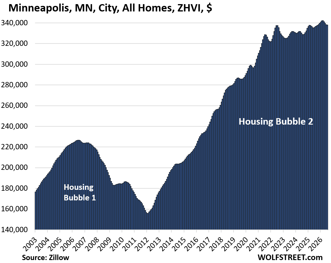
| Minneapolis, MN, City, All Homes, Prices | ||
| MoM | YoY | Since 2000 |
| -0.1% | 0.7% | 194% |
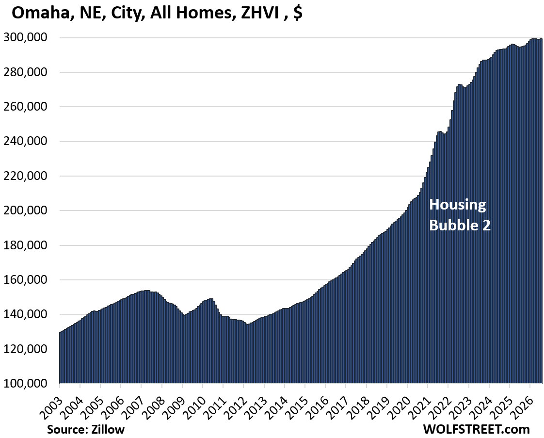
| Omaha, NE, City, All Homes, Prices | ||
| MoM | YoY | Since 2000 |
| 0.2% | 1.7% | 151% |
| New York City, NY, All Homes, Prices | ||
| MoM | YoY | Since 2000 |
| 0.2% | 3.9% | 240% |
| Chicago, IL, City, All Homes, Prices | ||
| MoM | YoY | Since 2000 |
| 0.6% | 4.5% | 119.5% |
In case you missed it: Sales of Existing Single-Family Homes Sink Deeper into Mud, Supply Jumps to 10-Year High, Condo Supply at 14-Year High
Enjoy reading WOLF STREET and want to support it? You can donate. I appreciate it immensely. Click on the mug to find out how:


Wow, Boston has caught right up with NYC. That probably explains why the rent for my maintenance neglected apartment built in the late 1960’s (and likely not remodeled since then) has increased from $1400 to $2150 over the last 8 years.
In the past year there’s been a lot of new multi family construction, but most of this supply isn’t finished yet and when it does come online, will be instantly consumed. The Boston metro area truly needs about 10x more additional supply to satisfy the insatiable demand for housing, and that’s not even counting additional demand due to population growth.
Mak,grew up outside of Boston and still work the region(semi-retired)and the last thing this area needs is 10X housing!
The traffic in the burbs already a nightmare,many towns water sheds getting stretched thin/property taxes keep risingetc.
The rent you pay,studio/one/two bedroom?
I have recently seen in the burbs not right on Boston line prices dropping on rents,not a lot but a start!
Housing built inside the Boston city limits especially TODs does not increase suburban traffic volumes.
Building suburbs (exurbs) increases suburban traffic volumes.
Hope that clears that up for you.
The Greater Boston-Eastern Mass. Metro Area is hemorrhaging around 125k mainly working age taxpayers annually, leaving the state for cheaper family friendly climes. The highest percentage of any state adjusted for population. This will soon enough relieve traffic congestion.
That $2150 is for a one bedroom apartment (probably about 750ish square feet). The demand for housing can’t be satisfied by current construction. As I said we need about 10x more.
In any case the traffic problem is because everyone wants to drive their own privately owned automobile. Using public transportation solves the traffic congestion problem, but sadly there are no real incentives changing human behavior.
Everyone wants their own single family home and to drive their own car. It’s because everyone wants these things, home prices are unaffordable and traffic is a nightmare. It’s simply not possible for everyone to live that way. So, what we end up with is people who got there first, denying everyone else the same opportunities. It’s the American way, I got mine, so get lost.
Eh,I do not live in city/surburban areas,land am looking for will be classified “rural”,we each have our own likes/dislikes.
Mak,you willing to live on train line out say Norwood/Walpole can save a lot on rent at moment but would then probably want a car for shopping etc.,probably not worth the financial tradeoff,tis best for folks who work in city but do not want to live there.
What you are paying living in Boston assuming at least fairly decent area is as strange as it sounds inexpensive.
You buy into the notion there is a housing shortage. NO, it’s one of can you afford housing! So many new complexes in Boston, downtown loaded with supply. New tower over South Station, still available to buy. What about the vacancy rates of these towers? As for commuting, how about the O line ,shut down for 2 weeks …AGAIN for maintenance. What we need is less people driving, and Healy(Governor) is doing her best to drive business and folks out of Massachusetts.
That’s the question I have about Boston, NYC, and Chicago. All are seeing housing price increases, which indicates increasing demand, which only occurs with significant job growth.
So what is driving the job growth in these three large snow belt cities?
I can somewhat understand Boston due to the concentration of schools and universities and associated research, but Chicago and NYC mystify me.
Chicago jobs have been increasing around 2% a year while average earnings increase is about 3.5%.
The city has poor conditions for new housing construction, politically sensitive to rejuvenating rundown areas and sits on a debt mountain.
Everyone wants to live in the same nicer/safer areas in the city and suburbs, made more intense by the increase in remote/hybrid working. There’s therefore a lot of competition for housing in those areas and housing inventory has remained tight.
It also didn’t have the same level of spike many other cities/states had post-covid. And it’s a bit less sensitive to interest rates than other parts of the country as values are comparatively lower with much of your monthly payment is property taxes, which is a larger proportion of a buyer’s monthly payment.
It’s an odd bundle of forces that make it very different market to the rest of the country.
Those damn liberal city’s there housing stock just keep going up in price despite the war on them from the admin along with high taxes etc. maybe there is something to this liberalism! popcorn out.
Go back to one of the gazillion other social media sites. This site, fortunately, sticks to more intelligent discussions.
Would love to see additional columns added to the first chart showing the values in real-terms adjusted for inflation since 2022.
1. No one, absolutely NO ONE in the entire history of mankind, has ever paid for a home in inflation-adjusted dollars. These suggestions are just intellectual feel-good BS.
2. These charts here ARE inflation indices in their own right: “home price inflation.” Consumers price inflation (such as CPI) has zero to do with home price inflation. And it’s nonsense to adjust one inflation index to another, though folks do it. You could for example adjust CPI inflation to PPI inflation, easy to do on Excel, but it’s nonsense.
3. If you want to check “affordability rates,” you use local prices, mortgage rates, local homeowners insurance premium, local property taxes, and local wages. But absolutely NO ONE in the entire history of mankind has ever paid for a home with an “affordability rate.” But yes, in places like Austin and Oakland, home prices have become “more affordable” or somewhat less unaffordable to local workers.
There is a point to be made that there are vast differences in the ratio of home prices and median wages.
E.g. use salary dot com to look up what you’d be paid in various cities, and then use a cost of living calculator like bestplaces to get the ratio of how much more or less expensive it is to live there, or what an equivalent cost-adjusted salary would be.
The result I’ve always found from doing this exercise is that living in the trendiest cities is not at all a good way to build wealth, as their high costs overwhelm the smaller salary increases. The easiest places to build wealth are generally low cost of living cities like Indianapolis or KC, or smaller cities and towns. Living in Boston or LA is just running on a rent treadmill.
Many of us who live in the Los Angeles area – particularly in the most expensive areas – do not pay rent nor do we ‘work for a living’ whatever that means.
I think it is important to look at data from all perspectives. Example: There is a 50% chance you will die today… Either you will die today, or you won’t die today. Another example: US IT employment is currently above 1980 levels, but adjusted for US population, IT employment really hasn’t changed. Looking at prices adjusted for other metrics is helpful when trying to determine value over time. According to GPT-5.6 Luna, Austin TX “real decline” is 36% (assuming the official CPI numbers are accurate)
1. If you use AI answers to argue, you will be blacklisted here. There is not enough time left in my life to waste it on a flood of AI slop.
2. So why don’t you adjust the US population to inflation? That’s stupid, right? But you can do it easily.
3. We look at ratios all the time, there are a gazillion here on this site, but they have to make logical sense. Using overall consumer price inflation to adjust the US population doesn’t make logical sense. Using overall consumer price inflation to adjust what is a home-price inflation metric doesn’t sense. Using local earnings to adjust local home prices DOES make sense but only if you want to track “affordability,” not home prices. No one tracks the S&P 500 in terms of affordability, or bonds, or gold, or any other asset. So why track real estate that way? There are some reasons for that, and there are some places that produce pretty good ones, with local data, but that’s irrelevant to me here.
I’m concerned for our nice peasant girl…she’s barely moved since scaling that wall…is she possessed?
About the article…to keep my low 3 mortgage rate or sell before Chicago metro finds peak bubble? Dilemmas…
The nice peasant girl is mesmerized by all hell breaking loose around here and watches with fascination as she sits on top of the paywall.
It’s a good think this information about the future of home prices didn’t reach me four years ago. I’d have thought another 2008 housing crash was occurring, and banks were probably failing.
Luckily, we’ve let inflation bear the brunt. All the suddenly rich homeowners and shareholders are mad about it though.
@Wolf – I don’t know if this has been asked before. Why do you call it housing bubble 2 (like housing bubble 1 of gfc) ?
Do you see a high chance of price declines ahead (say 20% or more) ? If not, then it seems like a natually rising market i.e. benign and not a bubble.
You’re wrong.
“Housing bubble” = prices soar beyond what’s economically feasible (such as 50% in 2 years, as they did in 2020-2022). It tracks the upward trajectory of these prices. A bubble is NOT a decline in prices, but SOARING prices. I started using “Housing Bubble 2” years ago to describe the soaring prices.
“Housing bust” = those prices fall back off those bubble levels. Housing bust tracks the downward trajectory of prices. I have used “Housing Bust 1” for years to describe falling prices after “Housing Bubble 1.
I have used “Housing Bust 1” and “Housing Bust 2” when applicable, for example here:
Housing Bubble & Bust #1 and #2 as Seen through Employment at Mortgage Lenders and Mortgage Brokers
thanks @wolf !
It’s only a “naturally rising market” if you ignore the Fed’s egregious policies that inflated housing for over a decade…
Hi Wolf,
The ‘since 2000 percentages’ don’t seem to make sense with some of the graphs unless prices declined dramatically between 2000-2003 (start of the graphs).
For example Oakland says ‘since 2000’ its up 248%. But in 2003, the prices were 350 and sloping down so guessing around 320ish in 2000. At 248% increase that would be prices should be 320 (base) + 320 (100%) + 320 (another 100%) + 160 (50%) (or multiply base 320 by 3.48) for a total of 1.113 million which is far above the current 700K.
Austin on the other hand seems right (base 200ish) with 150% increase is 200*2.5 = 500K which is the current price.
Free math lesson: How to calculate percentage increases:
Oakland was 206,000 in Jan 2000; and now it’s 717,000 = 248% increase or (2.48+1) X 206,000
To calculate the percentage increase, you use this formula: (717,000-206,000)/206,000 = 2.48 or 248%
or beginning value = 200, ending value = 300, then percentage increase = (300-200)/200 = 0.5 or 50%
Conversely, percentage decline: beginning value = 300; ending value = 200, then percentage decline = (200-300)/300 = -33%.
In other words, your favorite stock rose by 50% from $200 to $300, and then declined by only 33%, back to $200, and you lost your entire 50% gain. If your stock rises by 100%, it only needs to fall by 50% to wipe out all the 100% gains.
If you own any kind of investment, you need to be able to do this in your head.
Thanks but I didn’t need the math lesson since my math was correct. What I could not see was the 2000 prices and didn’t realize some markets were dramatically different than the 2003 price (Austin wasn’t which is why it made sense).
For Oakland, 206*3.48 (2.48 + 1.00) = is indeed 716 the current price. It’s the 2003 price that’s dramatically higher (350) without knowing the 2000 price that makes it look wrong.
Any chance you can in the future extend the graphs back to 2000 since you are posting the ‘since 2000 percentage’ or change to ‘since 2003 percentage’?
I won’t take them back to 2000 because all the current details get lost in long-term charts. But I will move the start year forward another year.
I always take the occasion of these posts to point out that transaction volumes are off by more than a third since the peak stupidities were reached.
So home “owners” (more accurately known as mortgage debtors…) might get the current median/mid tier prices listed…but they are going to have to market their homes for a *lot* longer…and pray to God that millions and millions just like them don’t try to exit too during the interim.
” ZHVI for all mid-tier homes (single-family, condos, and co-ops) must have been at least $300,000 at some point” What is top of the mid-tier range?
“mid-tier” = middle third in each market. So the middle third in that particular market must have reached $300,000 at some point.
When looking at the MoM and YoY it looks like solid gains may be happening in some of these cities for affordability.
Then a guy looks at the since 2000 percentage increases.
It really puts it into perspective how wild all this is……especially the 300 plus gain in some of the cities.
Edward Dowd recently put out a quick post saying simply “Number of US homebuyers
falls to lowest level ever recorded”,” adding that “there is no way to spin this as good.”
Yes, Wolf has put out confirming articles and charts, however I just can’t stop thinking about the cliff up ahead, or better yet, the brick wall. A critical thinker should predict a real estate catastrophe in the near future.
A quick search says that homebuyers are at their lowest level since 2013, when they first started keeping track. Do they think we are morons? First started keeping track in 2013?
Wolf writes his columns like ‘business as usual’ with these tiny down movements is some markets, but blazingly insane prices in most markets.
Nothing is rational, normal or stable about the housing maeket.
Careful here. Different concepts.
This article here is about “home prices.”
What you cite, they’re talking about “home buyers,” kind of a foggy concept… how many people were looking at homes or whatever. That concept doesn’t go back very far.
Then there are “home sales” — how many “closed sales” of existing homes in one month, so deals that fall through don’t count — and the data goes back to the 1980s. And you see my stuff on “home sales” every month when the data is released. See article link and chart below.
Tomorrow the data will be released for “pending home sales” — not closed deals, meaning that some of those will fall through. They’ve been terrible. So check back tomorrow.
In terms of “closed sales” of existing homes, I posted this article on Aug 11 when the data was released, with this headline, and lots of charts, so click on the link:
“Sales of Existing Single-Family Homes Sink Deeper into Mud, Supply Jumps to 10-Year High, Condo Supply at 14-Year High”
https://wolfstreet.com/2026/08/11/sales-of-existing-single-family-homes-sink-deeper-into-mud-supply-jumps-to-10-year-high-condo-supply-at-14-year-high/
Looking forward to the condo update! It will form a good baseline for the coming condo price correction coming over the next eight months, due to some major federal law changes aimed at condos.