No, our American consumers didn’t suddenly perform a miracle.
As part of the data dump on Friday, the Commerce Department released its estimates for retail sales for September. If you just looked at the headlines, you’d get the impression that our American consumers suddenly had gone out to splurge, fired up by two powerful, destructive, and deadly hurricanes:
“U.S. retail sales surge, driven by autos and gasoline purchases”: Reuters
“Retail sales in September surge most in 2 years”: Los Angeles Times
“Storms Surge and US Retail Sales Surge; Most in 2 ½ Years”: New York Times:
“U.S. Retail Sales Rose 1.6% in September: Strong car sales and higher gasoline prices power largest one-month increase since March 2015”: Wall Street Journal
“U.S. Retail Sales Rise Most Since 2015 on Storm-Related Lift”: Bloomberg News
So US consumers performed one their infamous last-minute miracles and suddenly got on the internet and drove to the mall and to auto dealers and splurged? The headlines pointed at the hurricanes and replacement demand, but this is what you get into when the headlines draw big conclusions from seasonally adjusted month-to-month data that is trying to estimate a very seasonal and volatile reality.
What are these glowing headlines talking about?
Retail sales rose 1.6% in September from August. That’s a big one-month surge, the largest since March 2015. And it appeared after retail sales in August had edged down 0.1% from July. But these sales figures are based on data that has been “adjusted for seasonal variation and holiday and trading-day differences, but not for price changes,” as the Commerce Department says. So in short, this is seasonally adjusted month-to-month data.
What happened really?
Not adjusted for seasonal and calendar differences, retail sales actually dropped by $23.4 billion or 4.8% from August, to $468.2 billion. Why? Because unadjusted retail sales always drop in September. August is part of “back to school” selling season. For example, in September 2016, retail sales dropped 4.9% from the prior month. So this September was right in line with its 4.8% drop.
And the peak month is always December. Last December, retail sales hit $542.1 billion. It will take another December to take out that record.
This chart shows monthly not-seasonally-adjusted retail sales in billions of dollars. Note the spike during the November-December holiday selling season and the plunge in January and February:
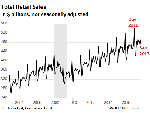
These vast fluctuations due to predictable seasonality make this chart difficult to read, especially for month-to-month observations. There is a lot of “noise” in it. So the Commerce Department adjusts this data to smoothen out the seasonal variations.
Seasonally adjusted data is only as good as the seasonal adjustments.
So how strong are the seasonal month-to-month variations that have to be adjusted out of it? Huge! This chart looks like my electrocardiogram when I get angry about the latest price increases, but it’s just the month-to-moth percent change of humdrum retail sales:
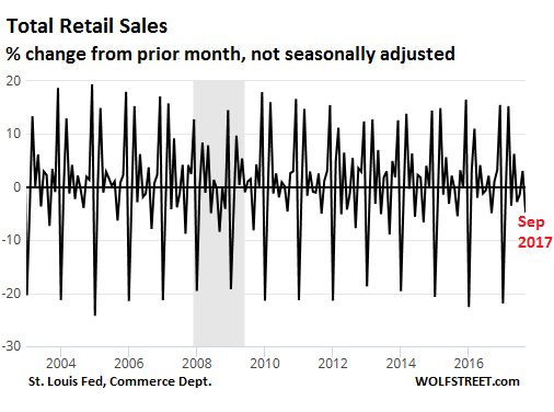
The range is from a month-to-month surge of 20% to a plunge of 20%, without anything drastic happening. These huge month-to-month variations require huge seasonal adjustments to smoothen them out. Any small error in estimating the needed adjustments make the seasonally adjusted month-to-month data useless.
So rather than get tangled up in the seasonal variations and adjustments, we can look at year-over-year changes in unadjusted retail sales, for example from September 2017 to September 2016. This mostly eliminates seasonal fluctuations, though trading-day differences remain. But with the 24/7-Internet grabbing an ever larger share, and with long store hours on weekends, trading day differences are declining in importance.
The chart below takes down the adrenaline level by a few measures. It shows the year-over-year percent change in retail sales. In September, retail sales rose 4.1% from September 2016. This was in the normal range since the Financial Crisis. It was better than in August, and it was the fastest growth in, well, four months:
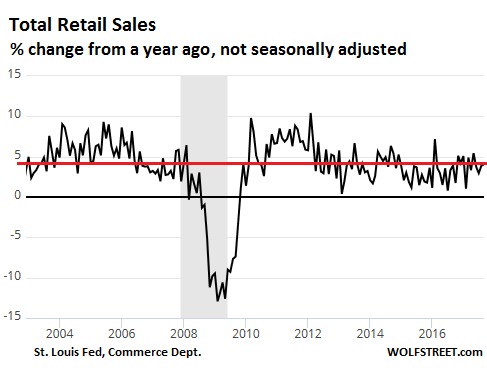
But price increases caused much of that.
This 4.1% is decent growth, but it’s “nominal” growth – meaning that price changes are not figured into this. Consumer prices, as measured by the Consumer Price Index released today, have surged 2.2% year-over-year in September. So on an inflation-adjusted bases, “real” retail sales – I’m just ball-parking here because CPI is based on total consumer spending, including things like rent that are not part of retail sales – would be up about 1.9% from a year ago.
So there’s not much to gush about in the headlines. It fits right in with the same languid growth rate the economy has seen since the Financial Crisis of around 2%, plus or minus a little, in real terms. Last year, the economy grew a lousier-than-usual 1.8%. This year, the economy will likely grow a little above 2%. Right on track to do absolutely nothing special. And retail sales in September were smack-dab in the middle of it.
What’s boiling beneath the Surging Inflation? Read… Yellen Was Right: “Transitory” Factors of “Low” Inflation Are Reversing, with Much More to Come
Enjoy reading WOLF STREET and want to support it? You can donate. I appreciate it immensely. Click on the mug to find out how:

![]()
If you included just the bottom 50%(the ones more likely to lose their jobs) and took away debt(at least credit card debt seems to be up in the last year) I wonder what those numbers would look like. I have a feeling not very good.
The chart does show a steady growth. It would be nice to see that in comparison to the growth in debts. It would also be interesting to see that in comparison to worker incomes. Just wondering how we are really doing. So much manipulation of data and noise.
Adjust the real data without price increases on a per capita basis that shows up as sales person and see what happens.
The USA is still a country with growing population and one would expect retail sales to increase as population grows………….
IMO that data would look a lot different.
(Here in Oz we have a really fast increasing population as a result of natural growth and a huge influx of immigrants that should result in retail sales increasing on a real basis over the year. We also suffer from high prices as a result of monopolistic markets and when retail sales fall here it means something is really wrong.)
I have always figured that the real CPI is the SPX, and the real SPX is the UST, and UST may be exchanged for items denominated in CNY although UST are indexed to the USD, which is subindexed to FDFD. Those UST cannot be repatriated from CNY into USD, but at some point they must come home, be paid off as it were in USD which in no way concerns the buyers of products denominated in CNY, those products have long since gone landfill and the USD is allowed to decline until consumers of CNY products must purchase new items to replace them in USD. This causes a rise in CPI hence the SPX goes higher unless the correlation breaks down.
Cpi,spx ust xyz,fbi,cia,mi5 no matter what it don’t look good.
“Those UST cannot be repatriated from CNY into USD, but at some point they must come home, be paid off as it were in USD which in no way concerns the buyers of products denominated in CNY, those products have long since gone landfill and the USD is allowed to decline until consumers of CNY products must purchase new items to replace them in USD. ”
In a very complex cycle, we have reached equilibrium. Those short-term UST’s held by the Chinese are replaced over time by longer-dated ones, and those products imported and subsequently disposed of are now being replaced by Vietnamese and Indian suppliers as the labor rate rises in China. Once China has outsourced more of their labor intensive operations, they will pass the torch and start issuing debt like we have been doing. It’s a slow, but certain process.
Trusting government and FED economic data is like trusting a drug dealer to warn you about the dangers of drugs.
I dont want to see unadjusted numbers, I want to see the REAL NUMBERS.
No chance that will ever happen, but with retailers closing like never before, there’s no way in Hades that retail sales grew, no matter how they spin the numbers.
Annual population growth in the U.S. is estimated at 4.7%. On a per-capita basis, our consumption is shrinking by at least 2.7% per year — during “good” times.
MF
US annual population growth is about 0.7% – not 4.7%
Not quite. Actually, not at all. The US population increased 4.7% in the SIX YEARS from April 1, 2010 to July 1, 2016 — from 308.7 million in April 2010 to 323.1 million in July 2016. That’s an annual rate of about 0.8%.
https://www.census.gov/quickfacts/fact/table/US/PST045216
here’s the new prophylactic to bring that population growth down
http://www.cnn.com/videos/cnnmoney/2017/10/06/trump-border-wall-prototypes.cnn
My bad.
Forgot to divide.
But — at least I finally got a reply to one of my comments. ;)
The point is still valid though. Per capita “growth” doesn’t exist in any meaningful way. Yet we have massive growth in asset values.
Yes, the point is very valid!! I think all national data should routinely be published on a per-capita basis (in addition to the versions they dish out now).
And about half is organic and half immigrants.
But this is a good point… yoy gives a more accurate view, and correcting for per capita also helps.
And another point raised here is credit card spending… adding it all together, was there any real per capita yoy sales growth not funded by credit cards?
John k
So your premise is credit card spending doesn’t count? How about cash from pay-day-loans, or cash-back house re-fis?
I spend (paying balance off each month) about $60k/yr on credit cards (I get 2% cash back with a Fidelity Visa).
Unlike what appears to have been your experience, not everybody with a card is financially irresponsible (in fact, less than a third maintain a revolving balance, and not all of them are irresponsible).
Without healthy immigration, US population growth would be zero or falling.
And wouldn’t that be lovely
Business as usual.
Something I read recently; ‘A natural disaster is supposed to be good for the economy. because it employs many people to fix the damage.
Its not true.
Like wanting a longer blanket, so you cut a foot off the top and sew it onto the bottom!’
The worker has been traumatized by threatened job or benefit loss and are afraid to speak up about wages, or even complain about working conditions. Because they’re just one paycheck away from being homeless.
The fed is attempting to force price inflation when there is no wage inflation. Instead, the majority of the working population are experiencing wage deflation, as the top 10% enjoy asset inflation.
At the best, the countries economic condition may be honestly described as ‘stagnant’. Yet according to the Evercore ISI Same Tax Survey, the last two times the survey plunged this much, the country was already in recession.
This is the first recovery that has been worse than the recession!
People with flood insurance usually take losses because the insurance only covers up to a maximum of about 250K for the structure and about 100K for contents. If they don’t have insurance they have to get a govt loan and that only saddles them with another bill. I read plenty of stories of people being wiped out by these limits.
Mark Twain said there are lies, damn lies, then statistics.
I was out spending money in September. I had to get a haircut, I had to buy sheets, I couldn’t pass up a good deal on household items I have needed to replace for years.
October is probably going to be up too, we went to the movies. And the Sears BBQ which we bought less than 18 months ago disintegrated and has to be replaced.
Great article Wolf and spot on about these growth figures not being all they’re cracked up to be.
I always use the banks financials as a barometer of how the economy is doing. This weeks a good week with the big four releasing Q3 results.
Wells Fargo as an example have reduced income’s quarter on quarter, their loan book has gone down by 5 billion quarter on quarter mainly in commercial and commercial real estate loans. Car loans also substantially down.
The cash deposits held for customers interestingly have gone up substantially.
It gives you a vibe that Businesses are borrowing less, consumers are borrowing less whilst building up more reserves.
Not a great story if the country wants to have higher growth figures, sort of gives you the sense that people-businesses are being more careful.
Not looked at JP Morgan, Citibank and Bank Of America but wouldn’t surprise me if they are showing the same story.
The Fake leading the Dumb.
With the massive volume of data available, one would expect at least some one in the MSM to be smart enough to do the kind of critical analysis like Wolf does and show the real facts.
But no, everyone is dispensing the same Kool-Aid.
Maybe Trump is right after all. It is fake news all around
Truth Always
Yes we have fake news everywhere. Take a look at the inflation data and supposedly we’ve no inflation. Yet the single largest item that is purchased in the US a home has almost doubled in price from 2000 to 2017. The numbers you get to see at http://www.usdebtclock.org are always moving but currently are about median home in 2000 was $165,000 now about $310,000 (like I said its an upward moving number). Wages since then have from $29,000 to $30,000 or $1,000 more. So BLS telling me that we don’t have inflation is akin to urinating on my leg and telling me my leg isn’t wet..
The Fed and the BLS want fake numbers on inflation as they want BS numbers to be able to justify paying less money out..
Media is run/owned by CFC members.. its programming.. not news.
– If you extend your chart to 1998, you might discover a trading range,
between the years 2000(H) and 2001(L).
– If you connect the 2012(H) & 2016(H) it is a resistance line.
The trend is down.
– From 2013, retail sales are flat, pumping muscles, to punch it down, to resume the downtrend.
– The highest ROC in E commerce were prior to the year 2000, but
E commerce at that time had a negligible weight.
– The combination of E commerce and brick is expensive, complicated
and your chart indicate that it is not bringing the expected results.
In the near future the fat will be trimmed.
– Your chart clearly shows that the Fed zero rates, have encouraged debt, but failed to boost the ROC.
The zero rates = fake !
– In the last few years wages are rising at average 2.5% y/y.
From 2013 on your chart indicate an average ROC of about 2.5%,
The last 5 years had accomplished nothing.
– The $USD, for almost year, is trending down. It will cont.
That will make import from China, commodities, food, oil – more expensive.
– If retail sales will spike, on your chart, above resistance it’s not a sign that the economy is doing great.
It is a warning sign. Everything is becoming more expensive for the US consumer and we cannot afford it.
A spike = recession.
– The stock market will be in troubles. The top 1% combine with the
pension funds, that finance future middle class retirement – both the top and the middle will be in troubles.
Numbers don’t lie but graphs always show a biased pictures. Why? Because graphics only show a small sample of all the data.
Are sales adjusted for inflation? They are measure din dollars, nor units. If prices are up but the number of shirts, shoes, coats is down, then the dollar figure is meaningless.
I spent my last 10 years working in the distribution center of a large US retailer (not to be named). We worked off “units processed”, not the dollar amount at the cash register. The sales numbers claimed by the stores do not jive with reality.Real inflation is way over the official government number.
Sales are in nominal dollars (not adjusted for inflation). Toward the bottom of the article, I approximated an inflation adjustment.
“We worked off “units processed”, not the dollar amount at the cash register. The sales numbers claimed by the stores do not jive with reality.Real inflation is way over the official government number.”
This is very true and a number the “Statisticians” (a word very close to “STASI” for some reason) avoid like the plague.
# of items sold Nationally must be going down every year otherwise. the graphs should look like expanding megaphones since 08 there has been a 25% dollar value sale increase. Adjusted for inflation and population growth, things are still heading SOUTH.
– If one Wolf Richter wants to know if the US economy is growing or not then he should look at the following formula (thanks to economics professor Steve Keen):
Income + change in debt = aggregate demand.
– With this formula Steve Keen was able to see that the growth peaked in november 2007 for Australia and growth peaked in november 2006 (!!!!) for the US.
-Mr. Steve Keen’s presentations can be found on YouTube and on Keen’s own website
(http://www.debtdeflation.com/blogs/)
(Can these figures for Income and change in debt be pulled form the FED’s website ???)
“Income + change in debt = aggregate demand.” Well, what simplistic misguided nonsense. Debt is also used for investment purposes and for leverage. I borrow $500,000 to buy $500,000 worth of stock, or I borrow $500,000 to buy a house. None of these two transactions go into “aggregate demand.” Yet both change the amount of debt outstanding.