The Fed has been using the unemployment rate, which dropped from 10% in October 2009 to 6.7% now, as incontrovertible proof that its heroic QE and zero-interest-rate policies were successful and that Chairman Ben Bernanke could ride off into the sunset with a nimbus above his head. Other measures that the Bureau of Labor Statistics publishes do not necessarily support such a glowing success story. And one measure has become the Fed’s official nightmare.
The Employment-Population ratio – the number of employed divided by the size of the working-age “non-institutionalized” population – is not affected by “discouraged” job seekers that are statistically eliminated from the unemployed. It’s not dogged by some of the other adjustments and beautified in the myriad ways of the unemployment rate. It’s the broadest most realistic measure the BLS produces. It peaked in April 2000 at 64.7%, zigzagged down, recovered some, then crashed during the financial crisis. In December 2013, it was 58.6%, mired at the bottom of its range, despite QE and ZIRP.
What a fiasco for the Fed! And now the propaganda machine at the Federal Reserve Bank of New York, which decided and handled the multi-trillion-dollar bailouts during the Financial Crisis, has launched an attack on the Employment-Population ratio. And it published a paper to kick off its campaign.
Since the end of the recession, the E/P ratio has largely remained constant – that is, virtually none of the decline in the E/P ratio from the Great Recession has been recovered to date. An implication is that the 7.6 million jobs added since the trough of employment in February 2010 has essentially just kept pace with growth in the working-age population.
Indeed, the very inconvenient “implication” is that the Fed’s policies succeed in inflating the values of financial assets and enriched those who held them but failed in the real economy. “The E/P ratio would seem to depict a much weaker labor market than indicated by the unemployment rate.”
So the report sets out to destroy that inconvenient implication as a “misleading characterization of the degree of the labor market recovery.” What caused the E/P ratio to mislead us? “Changing demographics.”
Aha. The demographics of the US, which normally take decades to play out, changed so quickly and so dramatically during the Great Recession that suddenly the most accurate measure of the employment situation becomes “misleading.”
How did the demographics eat the Fed’s homework?
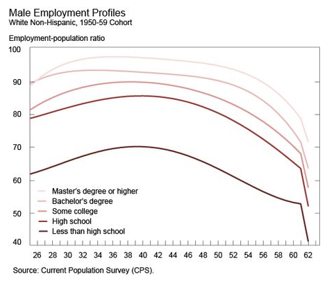
The employment rate profile over a worker’s career has an inverted U-shape, with rising employment rates until a worker reaches her mid-30s to mid-40s, then leveling off and declining in her 50s with sharp drops at 62 and 65. The effect of population aging on the E/P ratio depends on the distribution of individuals in the economy across the rising and falling sections of their career employment rate profiles.
The report gets entangled in a convoluted explanation that surely no one is supposed to read. By using monthly data of “10.2 million observations on individuals and their employment status,” and sorting it by age group and education, it comes up with inverted U-shaped employment profiles. The least educated people have the lowest employment-population ratios that fall off the steepest when they reach 62. Those with master’s degrees or higher enjoy the highest ratios and a much smaller drop-off at 62. Each sub-segment would have a different profile. This is the graph for the sub-segment of white males, vintage 1950-59. Intuitively, this still makes some sort of sense.
But then the willful adjustments start. To get a better handle on things, the report statistically removes the “business-cycle effects” on the employment-population ratio. So the ups and downs caused by recessions and recoveries are ironed out like unwelcome wrinkles.
Then they slice and dice the data to their liking:
For each of the 10.2 million individuals in our sample, based on their decade of birth, sex, race/ethnicity, and education, we select one of our 280 estimated career employment rate profiles. Using the worker’s age, we calculate the predicted employment rate for that individual based on their selected employment rate profile. We then calculate the weighted average of these predicted employment rates across all individuals in a given time period to generate an estimated E/P ratio for that time period. We repeat this exercise for each time period covered by our data.
Got it?
Me neither.
This intricate statistical legerdemain produces “our demographically adjusted E/P ratio.” But it still doesn’t quite convey what it is supposed to convey. So they proceed to “seasonally adjust this estimated E/P ratio.” I mean, come on.
And then they adjust the resulting product again by “normalizing” the data over the 31 years of the data series.
Out comes this newly concocted, “normalized, demographically adjusted,” seasonally adjusted, no-business-cycle E/P ratio (in blue) laid over the actual E/P ratio (in red):
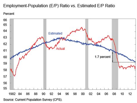
Thus, the employment boom, indicated by the soaring employment-population ratio from the early 90s to the peak in 2000, didn’t exist. So forget about those years. That secondary peak just before the Financial Crisis? That didn’t exist either. Forget about that too. And that cliff these jobs fell off during the Great Recession to never recover? That didn’t exist either. The actual E/P ratio is just “misleading.”
Instead, the real peak, according this ingenious piece of propaganda, occurred in the mid-1990s and has been steadily eroding since. Look, the Fed’s policies have had no impact on the curve. And to our googly-eyed amazement, recessions have had no impact either. So they conclude:
We have argued that the E/P ratio is a misleading indicator for the degree of the labor market recovery. However, the normalized, demographically adjusted E/P ratio is a useful additional gauge of labor market conditions.
“Demographic factors” – rather than realities in the job market and the Fed’s failed policies – “are exerting downward pressure on the actual E/P rate, suggesting that the recent lack of improvement in the E/P ratio does not imply a lack of progress in the labor market.”
Aha. Got it. There has been no lack of progress in the labor market whatsoever. We’ve just been looking at a misleading measure. The Fed’s propaganda machine finally solved that nagging problem and wiped away any doubts by emasculating the actual E/P ratio. We can now go back to admiring the Fed’s unmitigated success and not be distracted by any malodorous whiffs of reality.
However, there are millions of people left out of this employment miracle. And their numbers are growing, not diminishing. Read….. “This Chart Is A True Representation Of The Employment Crisis In This Country”
Enjoy reading WOLF STREET and want to support it? You can donate. I appreciate it immensely. Click on the mug to find out how:

![]()