The unemployment rate is a complex measure based on surveys and some grotesque definitions, including who gets counted as “unemployed.” These definitions eliminate millions of jobless people from the list of the officially “unemployed.” The resulting grotesque data – grotesque in, grotesque out – is then adjusted to paper over nagging real-world issues, such as seasonality. The result is a number that is easy to toss around during speeches but hard to use for gauging what’s really going on in the labor market.
The unemployment rate’s inability to accurately portray the labor market has caught so much flak that even the Fed abandoned it as a trigger for unwinding its zero-interest-rate policy. Instead, it will “take into account a wide range of information….”
OK, the Fed has other reasons for throwing off the self-imposed yoke. It certainly wouldn’t want to be pushed by that single number into depriving its cronies on Wall Street of their free-money elixir. Whatever its reasons, it threw out the unemployment rate. And that’s a good thing. It’s a useless number.
But the Bureau of Labor statistics and other entities produce other measures of the labor market, and overall, we know what’s going on.
And what’s going on is still a fiasco.
So, employers are no longer laying off workers in monthly tsunamis, as they did during the financial crisis; we know because new unemployment claims have been relatively low over the last couple of years.
And employers are hiring. We know because the Employment-Population Ratio has stabilized at very low levels. They’re hiring enough to keep up with the growth of the working-age population. That’s about it. They’re not hiring enough to pick up the millions of “unemployed” or mere jobless.
Among the “unemployed,” the fiasco shows up in the average duration of unemployment – before they either find a job or get tossed on the no-longer-counted pile of the mere jobless.
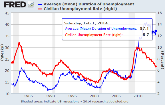
The unemployment rate normally peaks at the end of a recession, and in some cases significantly later – as in the “jobless recoveries” of the early 1990s and early 2000s. The average duration of unemployment peaks even later. The pre-financial-crisis record duration of unemployment had been set in July 1983 at 21.2 weeks. The unemployment rate had peaked half a year earlier at 10.8%.
This was the worst it could get, we thought…
Until the financial crisis spooked employers into plowing under millions of jobs. Then they made structural changes that eliminated many of those jobs forever.
This chart, which compares the unemployment rate (red line) to the duration of unemployment (blue line), shows better than anything else the nature of the still ongoing unemployment fiasco in the US, despite the steadily declining unemployment rate.
The unemployment rate maxed out at 10% in late 2009, after the recession had ended. By that time, the duration of unemployment had shot up to 29.7 weeks, a new horrific record. But then something happened – or rather didn’t happen. Instead of changing course a few months later in parallel with the unemployment rate, the duration of unemployment just kept rising and rising and rising.
It didn’t peak until the end of 2011 – two years after the peak of the unemployment rate – at a previously unthinkable 40.7 weeks. Nearly twice as long as during the worst month in 1983. And these were the lucky ones, so to speak, who still got counted as “unemployed!” Not the ones who’d been tossed on the ignored pile of the jobless.
But then the duration of unemployment dropped. A year later, in December 2012, it was down to 35.4 weeks. Politicians were breathing a sigh of relief. The Fed started to look competent. Hallelujah! And they were extending the line down along that trajectory. Soon, the duration would be in the realm of the bearable. But that’s exactly what didn’t happen.
The duration of unemployment has not improved one iota since.
In fact, it has gotten worse: 37.1 weeks. It takes the unemployed nearly 9 months on average to get hired … or to get purged from the list because they got discouraged and stopped looking or whatever and didn’t fit the definition of “unemployed” anymore. For the people who don’t have a job, this economy is still a fiasco.
They’re in a hellish position. A nine-month average means some people find a job fairly quickly, but many others are looking for years. They burn through their savings. They lose contact with their industry. Their skills aren’t updated. Depression can set in. Once they’re desperate enough, they end up accepting whatever they can get even it pays a lot less than their prior job – to the detriment of the whole economy.
The other tragedy in this number is that the Fed has relentlessly printed over $3 trillion for the benefit of what David Stockman calls the “Wall Street casino.” And it has artificially repressed interest rates and demolished savers and retirees in order to fatten up the banks and allow executives and employees to extract record bonuses. Fact is, the duration of unemployment has gotten worse for four out of the five years that the Fed has inflicted its loose monetary policies on the real economy. And it has gotten worse since QE3 started in late 2012!
Enjoy reading WOLF STREET and want to support it? You can donate. I appreciate it immensely. Click on the mug to find out how:
![]()


