Balance Sheet as % of GDP: Fed, ECB, BOJ, BOE, and Central Banks of Canada, Australia, New Zealand, and Sweden
By Wolf Richter for WOLF STREET.
This came up in our illustrious comments today on the ECB’s accelerated balance sheet QT. The ECB and the Bank of Japan have this year accelerated their QT, while the other central banks have slowed QT (such as the Fed) or have ended their QT (such as the Bank of Canada).
And the question was: Are the ECB and the BOJ seeing something different that the Fed and others don’t? This can best be answered by showing where each of these central banks’ balance sheet is in comparison to the others – and there are vast differences.
The big central banks that for years had huge QE programs and piled on assets for whatever rationale – Federal Reserve, ECB, Bank of Japan, Bank of England, Bank of Canada, etc. – flipped to QT in about 2022.
Except for the Bank of Japan, which took a lot more prodding from surging inflation and the plunging yen before it too kicked off QT at the beginning of 2024. It has been accelerating QT since then and is now shedding assets at a substantial clip.
The best measure to compare central bank balance sheets to each other, is in terms of the size of their balance sheet compared to nominal GDP, so their total assets in local currency expressed as a percentage of that country’s nominal GDP in local currency.
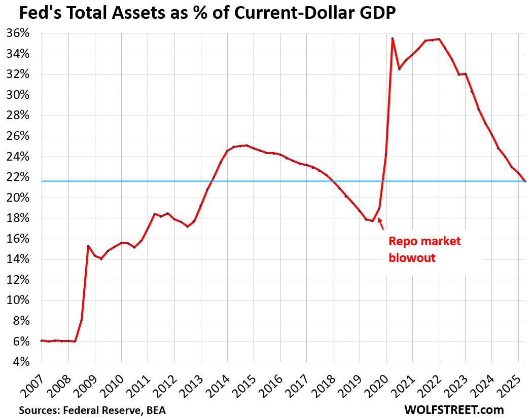
We’ve been discussing the Fed here, and its total assets have dropped to 21.6% of nominal GDP, where it had first been in Q3 2013 (total assets divided by “current dollar” Q2 GDP).
One of the questions in our comments was about QT by the Reserve Bank of Australia, which I don’t cover. So I gave the RBA’s website a look-see. In its chart deck as of October 2025, there is a chart of the assets-to-GDP ratios for eight central banks, in two parts, side-by side:
Left side:
- Bank of Japan
- ECB
- Bank of England
- Federal Reserve
Right side:
- Reserve Bank of New Zealand
- Sweden’s Riksbank
- Reserve Bank of Australia
- Bank of Canada
The reason they’re in two different parts is the vastly different magnitude of the ratios (chart from the RBA).
Massive joint backtracking on QE.
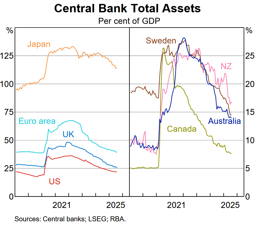
The mega-QE central banks are on the left side, whose balance sheet at the peak of QE ranged from 35% of GDP at the Fed to over 130% for the Bank of Japan. The BOJ is still above 110% of GDP, while the Fed is below 22% of GDP.
The central banks in the right chart never did that much QE, with the Bank of Canada maxing out at 25% of GDP. The others maxed out in the 26% to 28% range.
The Bank of Canada has ended QT as its assets are now at around 8% of GDP, which is where the Fed was before 2008. Assets of the Riksbank and RBA are now at around 14% of GDP.
Japan really needs a chart of its own. Its ratio dwarfs the ratios of the other three – ECB, BOE, and Fed – and distorts the view.
But they’re all seeing the same things: The continued threat of inflation and huge distortions and risks in asset prices. And they’re trying to walk back from those threats. The BOJ sees the additional risk of the yen plunging even further against other currencies.
Enjoy reading WOLF STREET and want to support it? You can donate. I appreciate it immensely. Click on the mug to find out how:

![]()
Thanks Wolf, it’s helpful to see those other countries ratios.
At first glance I didn’t pay attention to the % axis on the right side of the chart. I thought, hey Look at the USA, we’re doing great!
Then I noticed the scale is different, Lol!!
I told you in the text that the scale is different because Japan is in the left chart, and it went over 130% so the scale on the left chart goes to 150% and the right chart goes to 30%.
I also told you in the first chart (my own) that the Fed went from over 35% at the peak to 21.6% now, while Canada’s BOC barely got to 25% at the peak and is now at 8%. Of the four big central banks, the Fed has the lowest assets-to-GDP ratio, though it’s far higher than the four in the right chart.
You could have just read the text?
“You could have just read the text?”
Yes, I did that. It’s a reading comprehension thing on my part. Been an issue since the 2nd grade.
At least it isn’t a logarithmic scale.
Japan and the JCB is going to test out the concepts of “inflation is good” and a declining currency helps exporters. The other concept is that the carry trade is low risk. I expect Japan will have a crisis decade where the foolish Japanese government debt bingeing will bring severe consequences. Like a college party where beverages are flowing and the food and entertainment is “on the tab”, the Japanese economic strategy looks risky to me.
Wolf, you have much more contact with Japan and its reality than I. What to do see as the future of Japan, its easy money JCB, and the Liberal Democrats that have pandered to Japanese voters.
Warren Buffett and company have acquired some Japanese holdings. Perhaps you should keep an eye on their perspective.
Thanks for the RBA info.
I just wanted to comment on the excellent video, the combined valuation of the top eight tech stocks (Broadcom has passed Tesla into number 7) is now $22.6 Trillion, it is very interesting to me that so many people are ranting about the national debt being so outrageously high but don’t see any bubble in the stock market (!!!)
And top 10 are 39% of SP500.
I’ve read an article today that theres is now an AI bubble in bonds as well. That Morgan Stanely or some such estimated bonds by AI companies to be 14% of all “investment grade” bonds from SP500, and AI is now the biggest sector in IG bonds. For perspective the banks are at 11%.
I honestly do not know what the above means. But I do observe now that (somehow) June NVDA deep out of money puts I bought at $182 are 20-30% more expensive now that NVDA is at $192. These were in the green practically same day as I bought them. I’ve seen this with Amazon once in the previous “bubble” – otm puts I bought for $500 (that was when Amazon got to $2400 pre-splits) sold for $10K at the bottom. I of course got out way too early at around $4K.
For the record Nvidia is now priced at $4.7 Trillion.
I had an “ah ha” moment about AI a few weeks ago. I was looking at a restaurant menu on UberEats, and the description said above it “Generated with AI.” It clearly wasn’t. The restaurant typed in the description, like it has always done.
When companies like UberEats and so many others have to lie about the supposed benefits to AI to justify their spending, that’s how you know it’s not justifiable.
A huge amount of society’s total profits are going into the AI blackhole. No one cares as long as it causes stocks, bonds and anything based on it to climb to stupid amounts.
I can see something minor, like a large company admitting the AI spending was a waste, and the whole house of cards comes tumbling down.
TS305 – I sometimes wonder, most unkindly, that a lot of ‘organic’ intelligence I encounter seems more homuncular in nature (…or, more likely, just another tragedy of the ‘median’…).
may we all find a better day.
Yeah…… These bubbles…..
Look at how much was put into “greening” – trillions, including huge subsidies around the world, making electricity so much more expensive ( I am happy to be in Canada and fairly low rates thanks to hydro (and oil))
And “climate change” is now bursting.
‘solar panels make my energy bills go up’ is the high level thinking i come to the comment section for
“but don’t see any bubble in the stock market (!!!)”
Tons of people have been warning of an equity bubble for a long time.
The debt and equity bubble stupidities are simply two facets of the same underlying corruption – decades of failed government policies/industrial decline/international competitiveness,
1) papered over with Government debt,
2) made possible by money printing,
3) creating inflation,
4) unsustainably boosting stocks.
This has been going on for a long time. People predicted this twenty years ago, some since August 15, 1971.
QT has been going on since 2022. That’s what the article is talking about. I don’t know what you’re talking about.
I think what Otto is talking about is the day that the dollar stopped being convertible to gold (had to google), going to fiat, and how that could lead to excesses in monetary policy due to lack of natural controls on the money supply and thus on the monetary policy authorities.
Currency is a mutually valued object which has evolved from elaborate sea shells, livestock, etc (there’s a great list if you google “Smithsonian forms of money” and “historic forms of money”) to metal coins to paper to digital. I call it a “shared hallucination”. Gold is kind of in the middle between commodity and the shared hallucination concept of value because it has use as adornment.
I find the “shared hallucination of value” quality of paper and digital money, stocks, crypto to be quite interesting. IMO demand pressure keeps the whole structure stable, like gravity forces the stones of arches together, keeping that structure stable, even though it seems like it should fall.
Wild then, that the period since 1981 marks the most stable period of inflation in US history. And the average inflation rate before 1971 and after 1971 are exactly the same!
@numbers,
“the average inflation rate before 1971 and after 1971 are exactly the same!”
I take it you weren’t around, or old enough to experience, 1971 to 1981? Prices went quite crazy then (sometimes to our advantage, as we had just bought CA real estate at fixed interest, and the capital gains on that property are still otherwordly). I know people still wallowing in cash flow from that swerve in assets (e.g., who bought apartments in CA).
Just finished reading Ken Rogoff’s new book “Our Dollar, Your Problem”. Rogoff mentions this interesting tidbit
“Few things shocked Marco Polo more than paper money back in 1275, when he visited the Court of Kublai Khan. His eloquent rendition describes how Khan’s mint, as if through alchemy, turned worthless tree bark into a store of value that citizens throughout the land accepted as payment without question……………albeit on the pain of death for refusal”.
While waiting patiently for comments by Ten Fore, Roger Wilco, or Ovur N. Ouwt, I’m a bit concerned that Automatics has a finger on the launch button. Does this mean we’ll get a fallout reply from Adam Balm?
Why are there no stats on the central bank of communist China? It is the second largest economy in the world.
From my new series about the big 10, worked on last night, which are going to become a periodic feature here:
The PBOC is part of the government, and its head is a cabinet-level position. It has changed a lot over the past 30 years, during which it became an actual central bank. But it does a lot of other stuff that is outside of what normal central banks do. It had also been the country’s sovereign wealth fund, but that was spun off and is now the CIC.
Hmmm… not knowing the where/what of the bad debt from their property bubble that imploded, it is interesting to see a plateau rather than a rise, especially when combined with covid.
Is all that stuff parked in federal level SPVs or delegated to regional level balance sheet structures. Or have they really let business/society eat it.
Looking fwd to the new series!
“Huge distortions and risks in asset prices.” Also known as the Wealth Effect, the goal of the Fed under Bernanke and Yellen. Strange to say, the Wealth Effect is not mentioned in the Federal Reserve Act, which talks about maximum employment, stable prices and moderate long term interest rates. I suppose that when the Fed is saving the world from the consequences of its own actions, legal technicalities don’t matter. If Trump ends the Fed’s supposed independence, will his appointees be worse than the current members of the Board of Governors and the FOMC? I doubt it.
Here here! The Fed has been the single greatest enabler of bad behavior the world has ever known. Nixon removed the last real monetary restraints in 1971.
Wild then, that the period since 1981 marks the most stable period of inflation in US history. And the average inflation rate before 1971 and after 1971 are exactly the same!
Totally false.
From 1971 to 2024 the average inflation rate was 3.94%.
From 1865 to 1971 the average inflation rate was 0.86% per year.
Caution! There is no good inflation index that goes back that far. The first halfway useable inflation index in the US was started in 1917 with data going back to 1913. The Minneapolis Fed has an annual inflation index that goes back to 1800 based on:
1800 to 1851 – Index of Prices Paid by Vermont Farmers for Family Living
1851 to 1890 – Consumer Price Index by Ethel D. Hoover
1890 to 1912 – Cost of Living Index by Albert Rees
1913- now – modern data
The CPI for all urban consumers goes back to 1947:
Between 1947 and 1971 (so excluding the high inflation period of the 1970s and 1980s), the average annual inflation was 2.6%.
Between 1971 and 1982, the average annual inflation was 7.6%
The US govt devalued the dollar in terms of gold in 1933 and our 37.8 trillion in debt could push modern inflation higher.
Perhaps I am reading it wrong, but the chart makes it look like the Bank of Canada reaches a maximum slightly above 25%, while the article says it reached a maximum below 20% of GDP. Regardless, it’s impressive that the BoC was able to complete their QT at this pace. Per the BoC website, CPI-trim is at 3% which is at the upper bound of their total-CPI range.
“slightly above 25%”
Correct. thanks
Wolf, does this mean US dollar will become stronger? Any positive news regarding less QE
The dollar is doing just fine against other currencies. Many currencies have plunged against the dollar, such as Russian ruble, Indian rupee, Turkish lira, yen… to list just a few of the larger countries. The EUR-USD exchange rate is roughly in the middle of the 25-year range.
What is going on is inflation. That’s the problem – not the USD exchange rates. Inflation is now a problem more or less everywhere.
Yes, inflation is the problem for everyone. So as inflation drives up prices and inflates the GDP figures, doesn’t this make this metric (% of GDP) somewhat irrelevant?
Stephen
“So as inflation drives up prices and inflates the GDP figures, doesn’t this make this metric (% of GDP) somewhat irrelevant?”
On the contrary. The ratio eliminates the effect of inflation which is why this ratio is so useful: total nominal assets divided by nominal GDP. Both are equally inflated by inflation (numerator and denominator), and so mathematically inflation cancels out.
Wolf, you’re a good dude. Someone asks for Australia’s central bank numbers and you give them the numbers in the next article. It’s Wolf’s kitchen, but you do like to show people that you can cook anything.
I’m convinced that Wolf is like Remy from Ratatouille and in the Fed’s kitchen helping them cook. Not only does Wolf have his own kitchen (Wolfstreet), he’s cooking under the hat for the benefit of us all.
One can dream…
I now have my own charts about the big 10 central banks, including China and India (and of course Australia), just spent hours doing it. This is really interesting stuff. I’ll post something in about a month or two.
Wolf – I was just thinking China’s (and India’s) would be very interesting but not sure how reliable the data would be. Comparing their economy to the broader globe generally shows what is really behind the curtain.
Excellent charts!
The data I will use comes from the Bank for International Settlements (BIS), an umbrella organization for central banks that are members of the BIS. So they have good data on their members (I can see that when I compare the BIS data about the Fed and the ECB to the data released by the Fed and the ECB), but the data lags a few months
Super interesting charts!
Yet they leave me with many more questions than answers.
How did BOJ manage to get to 100% pre pandemic without much inflation, while US got major problems at 35%? Does Canada reaching 8% mean US has a lot of room for QT? I think you mentioned a few times recently that there’s actually not that much room for QT for the Fed. Maybe it’s the rate of change in these time series that correlates better with inflation? Or maybe the underlying systems are too complex to try and reason about from looking at just a few variables.
Good questions!
Because inflation is complex and has many causes, of which QE is only one?
At the risk of taking a literary ass whoopin’ from Wolf, the key to inflation and monetary policy is not the amount of money, but where it goes. Pre-COVID it went into the wealth effect of stocks and real estate. After the COVID supply shocks, it went into consumer goods. Folks love their asset inflation, but hate their consumer goods inflation.
The differences are in the velocity of circulation. E.g., Japan has a lot of “saved” demand deposits.
Supposedly, Japanese are more frugal with spending and save more compared to Americans but I don’t know.
Four days ago this article came out:
“Reuters
PM Orban says Hungary should not adopt euro as EU is ‘disintegrating'”
This leader of Hungary apparently has “the inside scoop.” Hungary is getting a lot of pressure from the EU to conform on everything, must be why PM Orban went public.
Orban is a Putin stooge and doesn’t belong in the EU. He needs to see if his people want to exit the EU and join Russia or something. Or his people could vote him out of office and stay in the EU. He says no matter what BS. The EU has never been more solid (minus Orban). Even the UK is coddling back up to the EU. Putin has done a wonderful job uniting the EU (minus Orban).
Orban is a corrupted felon. He is manipulating the Hungarian people to the profit of his friends and family.
Check out the Hatvanputza castle as well as Putin palace by the Black Sea. Open you eyes and search Wikipedia
You make the mistake of assuming that western military supplies to the Ukraine are intended to win the war. They aren’t and can’t, and the US and EU know that. They are intended to crush Russian military advances and bleed the Russian military dry. They have been incredibly effective at that. I’ll concede that sustaining that effort when the general public wants immediate victory is politically difficult. We are also seeing Russia and the Ukraine learning how to fight a 21st century war, where WWII style massed armor, big ships and air superiority become a thing of the past.
Kent – Well said. It’s the modern version of the cold war using Russia as a pawn to keep our military industrial economy booming.
Orban wants the benefit of trade with the EU but doesn’t want to
face pressure from the EU on policies he disagrees with such as immigration, funding Ukraine’s
war effort, etc… Adopting the Euro
is a mixed blessing.
The only reason Hungary can appear to act independent of the EU and NATO is that Hungary is cosily tucked inside the group, far from the front lines of the largest war in Europe since WWII. Not so for the newest members of NATO, Finland and Sweden. Both cases are amazing for different reasons. After WWII Finland was permitted a degree of independence by the USSR, except for international connections. This resulted in the English word: ‘Finlandization’
For Finland to exit Russia’s orbit and enter NATO is stunning.
But so is Sweden’s entry. Neutral for 200 years, no longer.
It’s incredible that Putin remains in power. He’s wrecked Russia’s economy: half the population spends half its income on food. , , Butter by the way is not always sold by the pound,,,that’s a substantial purchase. It’s often sold in sticks of much less.
Up to a million Russians have been killed or injured in Ukraine. Mercenaries are sought everywhere. A Chinese merc has posted ‘don’t come here’: He got 30 days detention in a 5 ft cube for something or other. No problems with the North Koreans sent by Kim. They have family in NK. For a while Russians in jail opted to join up, then word got back it was better to stay inside.
The only pity is that Hungary can’t be moved out of Europe, up to the Russian border and then the couple could live happily,,,for a while.
I got to date a wonderful Moscovite back in 2021 while she was studying in the US. We didn’t talk politics much, but I kinda mentioned Putin and from her perspective he’s mostly tolerated, they were more afraid of the power vacuum that would happen if he left. The devil you know i guess
Thanks for the excellent graphics. Having these in all one place is soothing for the eyes to look at, even if we know the numbers individually.
The next shoe to drop will be an end to fiscal profligacy. As the monetary tightening continues, long-term yields may no longer be artificially suppressed and Bond vigilantes will ask for higher yields unless the fiscal deficits are pruned. Japan will be the first one in my view – it is simply impossible to manage a 250% debt if yields are not artificially suppressed by the Central Bank. US will follow, their size is so astronomical that I just don’t see how they can continue to spend like there is no tomorrow without causing nominal assets to shoot through the roof – Gold is showing the way.
Once the Central Banks and the governments get their act together, maybe we can go back to the happy 90’s – low inflation, low growth.
Or maybe we won’t – a short recession and everyone will back to printing money.
Total inflation from 1990-2000 was 32%. Total inflation from 2015-2025 was 36%.
Total GDP growth from 1990-2000 was 70%.
Total GDP growth from 2015-2025 was 66%.
By using an entire decade as the timeframe you’re ignoring what happened over shorter periods of time.
1990-2000… relatively low but consistent inflation throughout the decade.
2015-2020… very low inflation due to offshoring and cheap imports.
2020-2025… very high inflation due to gov’t stimulus, supply shortages, re-shoring etc.
Nice charts!
Yes, very informative charts.
Were there any central banks that did not perform QE?
It’s no longer the central banks that are fueling risk investment. Investment isn’t being rotated from the rest of the S&P500 companies into the top AI companies. The money isn’t coming from cashed-up individuals who are enjoying low but safe returns. The risk investment money must be coming from loans. Those loans are secured by assets. The problem arises when some of those loans start to be called in or investments become worthless and the securing assets have to be sold. We have not yet seen a black swan event that can cause the unraveling to happen, but they have happened in the past. There was the Long-Term Capital Management collapse and the Lehman Brothers collapse. When such an event happens, the Fed will cut rates and stop the financial system from imploding, but that won’t support the prices of overvalued risky investments. We wait.
What’s amazing to me in this article is the central bank that’s conspicuously absent: the People’s Bank of China.
I won’t claim to understand how the Chinese financial system works, but my impression is that they use different tools, such as directing state banks to issue loans to businesses directly, instead of using QE.
Is there any reliable published statistic for the PBoC that could be considered equivalent to the Western central banks’ QE? With China facing deflation, I’m guessing they are not doing any reduction in their balance sheet.
Interesting take, but there are many fungible “assets” out there. Central banks and their balance sheets are becoming less relevant every day. As the poster above points out, the PBoC is relevant (as much as any of these other central banks) and who knows what their balance sheet really looks like.
Hedge accordingly.
“…the PBoC is relevant (as much as any of these other central banks) and who knows what their balance sheet really looks like.”
So the PBOC is part of the government, and its head is a cabinet-level position. It has changed a lot over the past 30 years, during which it became an actual central bank. But it does a lot of other stuff. It was also the country’s sovereign wealth fund, but that has been spun off and is now the CIC.
From my new series, worked on last night:
As clarified above, two distinct categories of inflation now. Asset and Main Street.
With our huge income inequality today, QE makes its way into asset inflation primarily which benefits the top 10%. Their spending will increase some for sure, but it does not put pressure on Main Street goods and services prices.
For Main Street inflation to occur, money has to be put into the hands of the bottom 90%. It also helps if it is timed with substantial shortages of key goods. Sounds like COVID shutdown to me.
The Central Banks are reducing their QE inflated balance sheets primarily to get them down for the next needed round of QE. Primarily optics in my opinion. Yes, it has some modest effect on inflation, but certainly not Main Street inflation. And frankly, at this juncture, little effect on asset inflation; although that is what I think they most trying to target.
The developed world has painted itself up into a corner. Were this to have occurred without any other major economic (and political) powers, it probably wouldn’t be such a concern. But China, Russia and the BRICS are now in a position to challenge US and Western Europe hegemony, with their economic and political strengths. That is why any comparisons of current economic factors/concerns cannot be compared to the 1970’s when the US went off the gold standard. There is a totally new economic order forming, and some of the past strongest economies will no longer be on top. Invest accordingly.
Thank you for the chance to comment.
Wolf, you are the man!
I was literally just thinking about this reading your article from yesterday. How is every main central bank’s balance sheet doing. The comparison was greatly needed. You know your readers! Thank you so much and thank you for reading our comments!
Cheers
Is this primarily a result of inflation? I.e. inflate the value of your currency to make gpd go up and pay back debt with devalued money?
What you state isn’t what this article or data is about. This data isn’t about debt, but about central bank assets as percent of GDP.
The ratio eliminates the effect of inflation which is why this ratio is so useful: total nominal assets divided by nominal GDP. Both are equally inflated by inflation (numerator and denominator), and so mathematically inflation cancels out.
The money is still out there, spent by the government. Nothing was drained
These are all Golden Billion countries.
Great job you did there! I think it would also be useful to have a chart of each central bank total assets as a percentage of their respective total government debt outstanding. It would complement well the amazing work you’ve done with this article.
In the last year US Treasury securities on the Fed’s balance sheet decreased from $3,707,128,000,000 to $3,578,675,000,000. It doesn’t seem too much of a decrease…only $128,453,000,000.
Someone fed you a line of BS. Your numbers = only Treasury “notes and bonds.”
Now add TIPS, T-bills, MBS, and Federal Agency Debt securities. And you will see that all combined, they fell by $364,092,000,000.
Bunch of comments applauding Wolf for his amazing research, and I totally agree. But it’s often the comments I get the most enjoyment from. The level of snark brings a smile to my face and just warms my soul.
Just wish there was a paid membership level that gives you a livestream feed of Wolf reading and answering the comments so I could experience the magic as it happens, lol
I’ll admit it — I just don’t get it. Why do central bank balance sheets “matter”?